The other day I looked at number of guns versus number of gun deaths by country, in countries like ours that have pretty good rule of law. The correlation is pretty clear: more guns, more gun deaths.
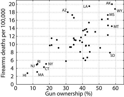
But I was also wondering about correlation within the U.S., by state. I’m pleased to find that Sam Wang’s got it:
I’d say that great minds think alike, but really: Sam — a professor at Princeton — has got it all over me when it comes to drawing valid conclusions from statistical data.* For instance: like Nate Silver, he called every state correctly in the recent presidential election. But his stated confidence level was way above Nate’s — between a 99.2 and 100% chance that Obama would be re-elected. That’s putting your reputation where your predictions are.
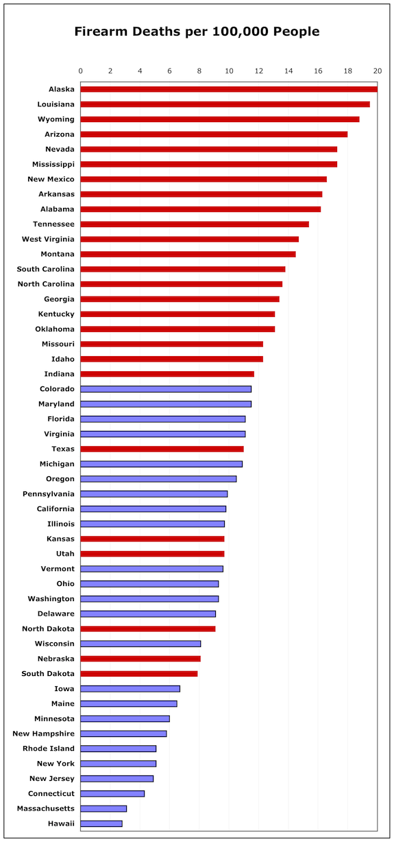
Read Sam’s post and the one preceding it. He makes all sorts of sense. He also gives us the sources, so I thought I’d show the data a couple of other ways. How about…red states vs blue states? Here you go:
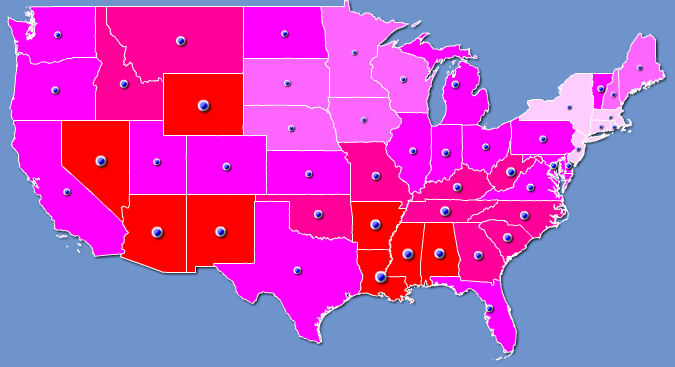
Does anyone see a pattern here? Here it is on a map:
Though I find that Richard Florida has beat me to it on this one:
You can quibble all you want about correlation and causation, but the simple fact is: if you live in a red state the odds of your children dying of gun violence is 75% higher than if you live in a blue state.
That may help explain why, when Americans vote with their feet and choose where to live, only 38% vote for red states.
It may also help explain why people in red states want guns so much: it’s dangerous to live in a red state. They’ve got all those guns.
I’m still asking: would you rather “feel” safe, or would you rather be safe?
* “Prof. Sam Wang‘s academic specialties are biophysics and neuroscience. In these fields he uses probability and statistics to analyze complex experimental data, and has published many papers using these approaches. He is also the author of Welcome To Your Brain, a popular book about his field.”
Cross-posted at Asymptosis.


