The 88 thousand payroll jobs added in March is from the establishment survey (a survey of businesses for payroll jobs), but the unemployment rate is from the household survey. To help understand the decline in the unemployment rate, here is some data from the household survey.
The “Population” is the Civilian Noninstitutional Population, or the number of people 16 and over who are “not inmates of institutions (for example, penal and mental facilities and homes for the aged) and who are not on active duty in the Armed Forces”. This is increasing every month, and increased 167 thousand in March.
The Civilian Labor Force is based on the percentage of people who say they are either employed or unemployed. This yields the participation rate (the percentage of the civilian noninstitutional population that is in the labor force). The participation rate has declined recently due to both demographic reasons and the weak recovery from the financial crisis. Separating out the two reasons is difficult, see: Understanding the Decline in the Participation Rate and Further Discussion on Labor Force Participation Rate and Labor Force Participation Rate Update.
If the participation rate increases, then it would take more jobs to reduce the unemployment rate. If the participation rate continues to decline (or just flat lines for a couple of years), then it takes fewer jobs to reduce the unemployment rate.
According to the household survey, the economy lost 206 thousand jobs (the establishment survey is MUCH better for payroll jobs added), and there were 290 thousand fewer people unemployed – so the unemployment rate declined to the lowest level since December 2008. We’d prefer to see the unemployment rate decline because of more jobs, as opposed to less participation.
| Employment Status, Household Data (000s) | |||
|---|---|---|---|
| Feb | Mar | Change | |
| Population | 244,828 | 244,995 | 167 |
| Civilian Labor Force | 155,524 | 155,028 | -496 |
| Participation Rate | 63.52% | 63.28% | -0.24% |
| Employed | 143,492 | 143,286 | -206 |
| Unemployed | 12,032 | 11,742 | -290 |
| Unemployment Rate | 7.74% | 7.57% | -0.17% |
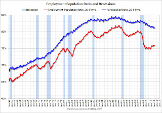
Employment-Population Ratio, 25 to 54 years old
 Click on graph for larger image.
Since the participation rate declined recently due to cyclical (recession) and demographic (aging population) reasons, an important graph is the employment-population ratio for the key working age group: 25 to 54 years old.
In the earlier period the employment-population ratio for this group was trending up as women joined the labor force. The ratio has been mostly moving sideways since the early ’90s, with ups and downs related to the business cycle.
This ratio should probably move close to 80% as the economy recovers. The ratio was unchanged at 75.9% in March. The participation rate for this group declined slightly to 81.1%. The decline in the participation rate for this age group is probably mostly due to economic weakness, whereas most of the decline in the overall participation rate is probably due to demographics.
Percent Job Losses During Recessions
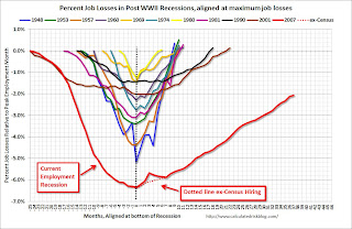
This graph shows the job losses from the start of the employment recession, in percentage terms – this time aligned at maximum job losses.
In the earlier post, the graph showed the job losses aligned at the start of the employment recession.
This financial crisis recession was much deeper than other post WWII recessions, and the recovery has been slower (the recovery from the 2001 recession was slow too). However, if we compare to other financial crisis recoveries, this recovery has actually been better than most.
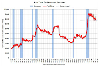
Part Time for Economic Reasons
 From the BLS report:
The number of persons employed part time for economic reasons (sometimes referred to as involuntary part-time workers) fell by 350,000 over the month to 7.6 million. These individuals were working part time because their hours had been cut back or because they were unable to find a full-time job.
The number of part time workers decline in March to 7.64 million from 7.99 million in February. This is the few part time for economic reasons since November 2008.
These workers are included in the alternate measure of labor underutilization (U-6) that declined to 13.8% in March. This is the lowest level for U-6 since December 2008.
Unemployed over 26 Weeks
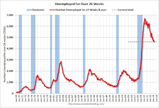 This graph shows the number of workers unemployed for 27 weeks or more.
According to the BLS, there are 4.61 million workers who have been unemployed for more than 26 weeks and still want a job. This was down from 4.8 million in February. This is trending down, but is still very high. This is the fewest long term unemployed since June 2009. Long term unemployment remains one of the key labor problems in the US.
State and Local Government
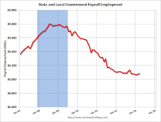 This graph shows total state and government payroll employment since January 2007. State and local governments lost jobs for four straight years. (Note: Scale doesn’t start at zero to better show the change.)
In March 2013, state and local governments added 7,000 jobs and state and local employment has increased 8,000 so far in 2013.
I think most of the state and local government layoffs are over. Of course the Federal government layoffs are ongoing with many more layoffs expected due to the sequestration spending cuts.
Overall this was a weak report, but there were a few positives including the upward revisions to the January and February reports, the decline in the long term unemployed, and the decline in part time workers to list a few.
All Employment Graphs