If you equate wealth and prosperity (not a crazy equation), then one of the best measures of a country’s prosperity is median household net worth. It arguably says a lot more about prosperity than various income measures. It tells you how the typical household (50% have more, 50% have less) is doing.
If lots of households have lots of wealth, that’s pretty much a description of a widely prosperous country – the kind we built in this country in the 20th century — at least until the late 70s/early 80s.
The best estimates we have of this measure come from the Fed’s triennial Survey of Consumer Finances. It started in ’89, and the ’13 report just came out, so we now have twenty-four years of surveys to look at.
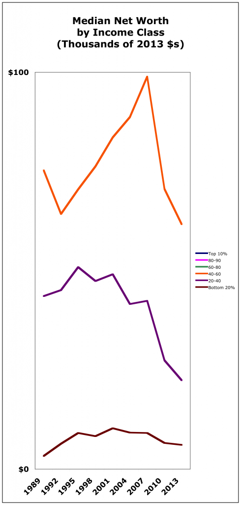
Here’s what that quarter century looks like:
Here it is zoomed in on the bottom 60% of Americans:
Top 10%: Up 61%, even with the post-’07 decline. (Top 1% and .1% got richer way faster even than that).
Upper middle class (60–90%): Up 25-32%. Pretty darned good. (Remember, these are inflation-adjusted dollars.) Imagine if we’d all done that!
Middle class (40–60%): Down 18%. Prosperity! Freedom!
Lower middle class (20-40%): Your net worth is down 50% from 1989. It’s been diving since ’95 — almost 20 years.
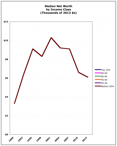
Lower class (bottom 20%): A huge spike — you’re up 85%! Except: 1. Your holdings are still trivial — $6,100. You’re only two or three months from being on the street. And: 2. You’re down 40% in the last twelve years. Here’s that graph zoomed in:
If you’re in the bottom 60%, here’s how you’re doing compared to the top ten:
I’ll say it again:
Widespread prosperity both causes and is greater prosperity.
We could all (collectively) be much richer right now, even as we could all be much richer.
A nod to income, and how it builds wealth: Say you’re a 50%er. Now imagine that in 2007, you and your friends were making $94,000 a year instead of the $76,000 you actually made. (That’s how much you would have made if wages had gone up with productivity — GDP per hour worked – since the 80s.)
Think we’d all be more prosperous?
Cross-posted at Asymptosis.


