These indicators are mostly for travel and entertainment – some of the sectors that will probably recover very slowly.
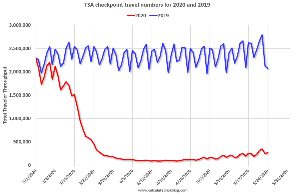
The TSA is providing daily travel numbers.
 Click on graph for larger image.
This data shows the daily total traveler throughput from the TSA for 2019 (Blue) and 2020 (Red).
On May 24th there were 267,451 travelers compared to 2,070,716 a year ago.
That is a decline of 87.1%. There has been some increase off the bottom, but it is pretty small compared to the normal level of travel.
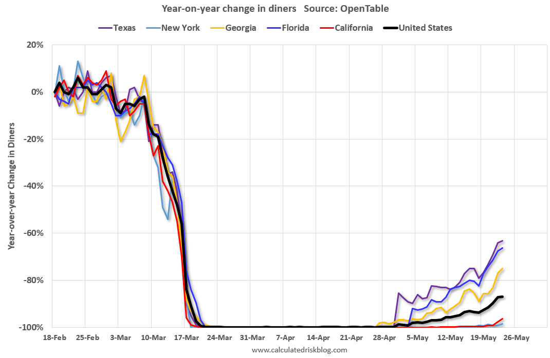
The second graph shows the year-over-year change in diners as tabulated by OpenTable for the US and several selected cities.
 Thanks to OpenTable for providing this restaurant data:
This data is updated through May 23, 2020.
The US was off 100% YoY as of March 21st.
California and New York are still off 100%.
Some states – like Texas and Georgia – have started to open up. In Texas, diner traffic was only down 63% YoY.
 This data shows domestic box office for each week (red) and the maximum and minimum for the previous four years. Data is from BoxOfficeMojo.
Note that the data is noisy and depends on when blockbusters are released.
Movie ticket sales have been essentially at zero for nine weeks.
Basically movie theaters are closed all across the country, and will probably reopen slowly (probably with limited seating at first).
The following graph shows the seasonal pattern for the hotel occupancy rate using the four week average.
 The red line is for 2020, dash light blue is 2019, blue is the median, and black is for 2009 (the worst year probably since the Great Depression for hotels).
2020 was off to a solid start, however, COVID-19 has crushed hotel occupancy.
Notes: Y-axis doesn’t start at zero to better show the seasonal change.
STR reported hotel occupancy was off 54.1% year-over-year last week. Occupancy has increased slightly over the last few of weeks.
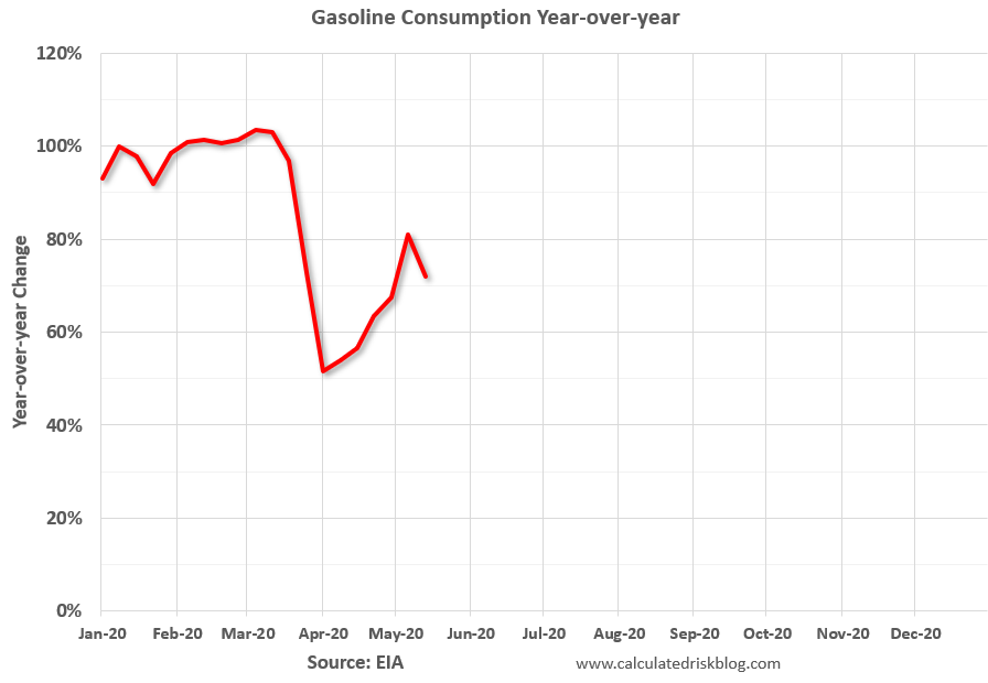 This graph, based on weekly data from the U.S. Energy Information Administration (EIA), shows the year-over-year change in gasoline consumption.
At one point, gasoline consumption was off almost 50% YoY.
As of May 15th, gasoline consumption was off about 20% YoY (about 72% of normal).
The final graph is from Apple mobility.
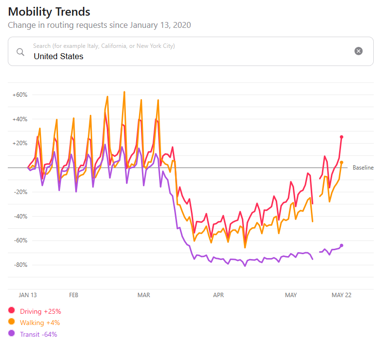 This data is through May 22nd for the United States.
According to the Apple data, driving is back to normal, walking is a somewhat below normal, but public transit is still off 64% from the pre-crisis level.