Note: I’ve added a New York specific indicator – subway usage – at the bottom.
These indicators are mostly for travel and entertainment – some of the sectors that will recover very slowly.
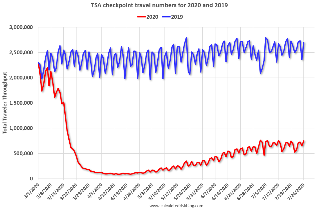
The TSA is providing daily travel numbers.
 Click on graph for larger image.
This data shows the daily total traveler throughput from the TSA for 2019 (Blue) and 2020 (Red).
On July 26th there were 751,205 travelers compared to 2,700,723 a year ago.
That is a decline of 72%. There had been a slow steady increase from the bottom, but air travel has mostly moved sideways over the last few weeks.
The second graph shows the 7 day average of the year-over-year change in diners as tabulated by OpenTable for the US and several selected cities.
 Thanks to OpenTable for providing this restaurant data:
This data is updated through July 25, 2020.
This data is “a sample of restaurants on the OpenTable network across all channels: online reservations, phone reservations, and walk-ins. For year-over-year comparisons by day, we compare to the same day of the week from the same week in the previous year.”
Note that this data is for “only the restaurants that have chosen to reopen in a given market”.
The 7 day average for New York is still off 77%.
Florida is down 60% YoY. Note that dining declined in many areas as the number of COVID cases surged. It appears dining has flattened out at a lower level (probably mostly outdoor dining).
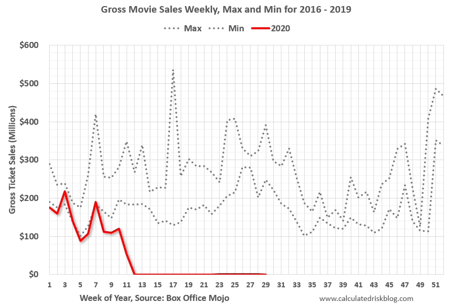 This data shows domestic box office for each week (red) and the maximum and minimum for the previous four years. Data is from BoxOfficeMojo through July 23rd.
Note that the data is usually noisy week-to-week and depends on when blockbusters are released.
Movie ticket sales have picked up a slightly from the bottom, but are still under $1 million per week (compared to usually around $300 million per week), and ticket sales have essentially been at zero for eighteen weeks.
Most movie theaters are closed all across the country, and will probably reopen slowly (probably with limited seating at first).
The following graph shows the seasonal pattern for the hotel occupancy rate using the four week average.
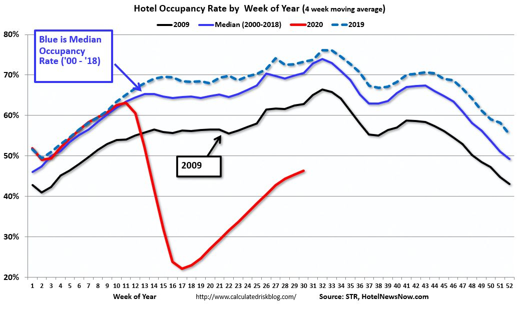 The red line is for 2020, dash light blue is 2019, blue is the median, and black is for 2009 (the worst year probably since the Great Depression for hotels).
2020 was off to a solid start, however, COVID-19 crushed hotel occupancy.
Notes: Y-axis doesn’t start at zero to better show the seasonal change.
The occupancy rate for the last five weeks was 43.9%, 46.2%, 45.6%, 45.9% and 47.5% The increases in occupancy have slowed and are well below the median for this week of 78%.
Usually hotel occupancy starts to pick up seasonally in early June. So some of the recent pickup might be seasonal (summer travel). Note that summer occupancy usually peaks at the end of July or in early August.
 This graph, based on weekly data from the U.S. Energy Information Administration (EIA), shows the year-over-year change in gasoline consumption.
At one point, gasoline consumption was off almost 50% YoY.
As of July 17th, gasoline consumption was only off about 12% YoY (about 88% of normal).
Note: I know several people that have driven to vacation spots – or to visit family – and they usually would have flown. So this might be boosting gasoline consumption over the summer.
The final graph is from Apple mobility. From Apple: “This data is generated by counting the number of requests made to Apple Maps for directions in select countries/regions, sub-regions, and cities.” This is just a general guide – people that regularly commute probably don’t ask for directions.
There is also some great data on mobility from the Dallas Fed Mobility and Engagement Index. However the index is set “relative to its weekday-specific average over January–February”, and is not seasonally adjusted, so we can’t tell if an increase in mobility is due to recovery or just the normal increase in the Spring and Summer.
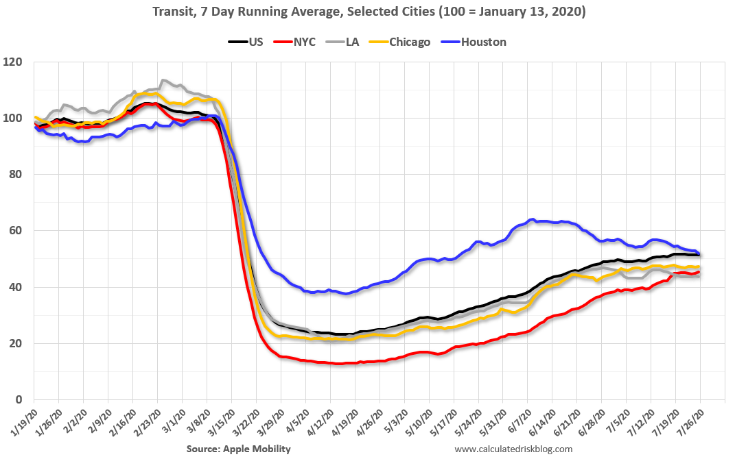 This data is through July 25th for the United States and several selected cities.
The graph is the running 7 day average to remove the impact of weekends.
IMPORTANT: All data is relative to January 13, 2020. This data is NOT Seasonally Adjusted. People walk and drive more when the weather is nice, so I’m just using the transit data.
According to the Apple data directions requests, public transit in the 7 day average for the US is still only about 51% of the January level. It is at 45% in New York, and 52% in Houston (down over the last few of weeks).
Here is some interesting data on New York subway usage (HT BR).
 This graph is from Todd W Schneider.
This data is through Friday, July 24th.
Schneider has graphs for each borough, and links to all the data sources.
He notes: “Data updates weekly from the MTA’s public turnstile data, usually on Saturday mornings”