These indicators are mostly for travel and entertainment. It is interesting to watch these sectors recover as the pandemic subsides.
Note: Gasoline consumption returned to pre-pandemic levels.
The TSA is providing daily travel numbers.
This data is as of January 23rd.
 Click on graph for larger image.
This data shows the 7-day average of daily total traveler throughput from the TSA for 2019 (Light Blue), 2020 (Black), 2021 (Blue) and 2021 (Red).
The dashed line is the percent of 2019 for the seven-day average.
The 7-day average is down 24.7% from the same day in 2019 (75.3% of 2019). (Dashed line)
The second graph shows the 7-day average of the year-over-year change in diners as tabulated by OpenTable for the US and several selected cities.

This data is updated through January 22, 2022.
This data is “a sample of restaurants on the OpenTable network across all channels: online reservations, phone reservations, and walk-ins. For year-over-year comparisons by day, we compare to the same day of the week from the same week in the previous year.”
Dining was mostly moving sideways, but there has been some decline recently, probably due to the winter wave of COVID. The 7-day average for the US is down 25% compared to 2019.
 This data shows domestic box office for each week and the median for the years 2016 through 2019 (dashed light blue).
 Note that the data is usually noisy week-to-week and depends on when blockbusters are released.
Movie ticket sales were at $100 million last week, down about 49% from the median for the week.
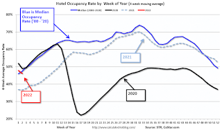 This graph shows the seasonal pattern for the hotel occupancy rate using the four-week average.
The red line is for 2022, black is 2020, blue is the median, and dashed light blue is for 2021.
This data is through January 15th. The occupancy rate was down 16.3% compared to the same week in 2019.
Notes: Y-axis doesn’t start at zero to better show the seasonal change.
This graph is from Apple mobility. From Apple: “This data is generated by counting the number of requests made to Apple Maps for directions in select countries/regions, sub-regions, and cities.” This is just a general guide – people that regularly commute probably don’t ask for directions.

The graph is the running 7-day average to remove the impact of weekends.
IMPORTANT: All data is relative to January 13, 2020. This data is NOT Seasonally Adjusted. People walk and drive more when the weather is nice, so I’m just using the transit data.
According to the Apple data directions requests, public transit in the 7-day average for the US is at 90% of the January 2020 level.
Here is some interesting data on New York subway usage (HT BR).

This data is through Friday,January 21st.
He notes: “Data updates weekly from the MTA’s public turnstile data, usually on Saturday mornings”.