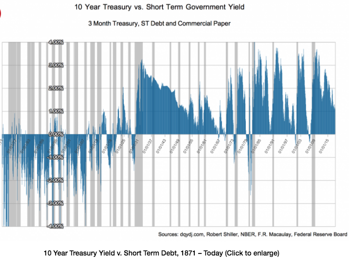
I recently came across a surprising graph:

It’s hard to read here, but if you go to the link and click on the graph, you’ll see a much bigger version.
There are some technical issues with its construction, which are discussed in the article. But when I looked at the raw data it seems plausible to me that the yield curve really was inverted during most of the 40 years before WWI.
Does anyone know why?