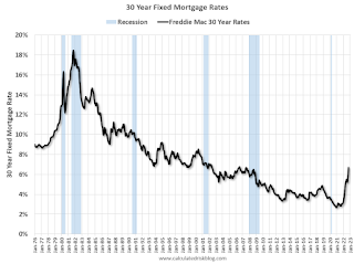
Here is a graph showing the 30-year rate using Freddie Mac PMMS, and MND for last week.

This is a graph from Mortgage News Daily (MND) showing 30-year fixed rates from three sources (MND, MBA, Freddie Mac) over the last 5 years.
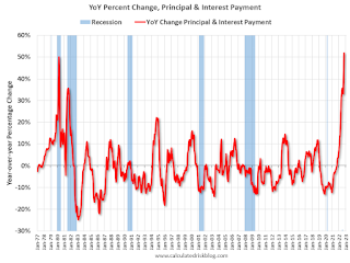
The following graph shows the year-over-year change in principal & interest (P&I) assuming a fixed loan amount since 1977. Currently P&I is up about 52% year-over-year for a fixed amount (this doesn’t take into account the change in house prices).

This is one of the reasons I’ve argued in my real estate newsletter Housing: Don’t Compare the Current Housing Boom to the Bubble and Bust, Look instead at the 1978 to 1982 period for lessons.