The TSA is providing daily travel numbers.
This data is as of September 25th.
 Click on graph for larger image.
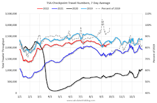
This data shows the 7-day average of daily total traveler throughput from the TSA for 2019 (Light Blue), 2020 (Black), 2021 (Blue) and 2022 (Red).
The dashed line is the percent of 2019 for the seven-day average.
The 7-day average is down 2.7% from the same day in 2019 (90.9% of 2019). (Dashed line)
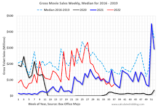
 This data shows domestic box office for each week and the median for the years 2016 through 2019 (dashed light blue).
 Note that the data is usually noisy week-to-week and depends on when blockbusters are released.
Movie ticket sales were at $71 million last week, down about 52% from the median for the week.
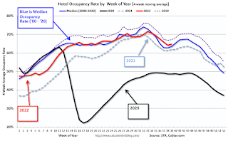
 This graph shows the seasonal pattern for the hotel occupancy rate using the four-week average.
The red line is for 2022, black is 2020, blue is the median, and dashed light blue is for 2021. Dashed purple is 2019 (STR is comparing to a strong year for hotels).
This data is through Sept 17th. The occupancy rate was down 2.4% compared to the same week in 2019.
Notes: Y-axis doesn’t start at zero to better show the seasonal change.
As of September 16th, gasoline supplied was down 6.9% compared to the same week in 2019.
Recently gasoline supplied has been running below 2019 and 2021 levels – and sometimes below 2020.
