You might wish to consider whether you and I hold the same views. Here’s a brand new commenter named kipd:
stats are made to be manipulated and then lied with you moron. try some time out here in the real world. EVERY business I can see needs people. I’m building a house. EVERY sub is begging for people. this crisis did not exist 3 years ago. you exemplify the “elitist” leftists of the phantasy utopia of big cities and college campuses.
Of course I agree that there’s a tremendous shortage of workers. I’ve discussed that problem in dozens of posts, well before most other pundits. So why does kipd assume that I disagree with him or her? (Based on the tone, I’m guessing “him” is the preferred pronoun.)
I presume it’s due to my recent post about the myth of the “missing workers”, the idea that workers left the labor force during Covid and never returned.
There are no missing workers; employment is at an all time high. The very real labor shortage is due to the huge surge in aggregate demand triggered by a recklessly expansionary Fed monetary policy. Full stop.
We have more than enough workers to produce an equilibrium level of output. But due to the high level of demand, firms are trying to produce a level of output far beyond equilibrium. We have a worker shortage, despite not having any missing workers. So tell me kipd, who’s the moron?
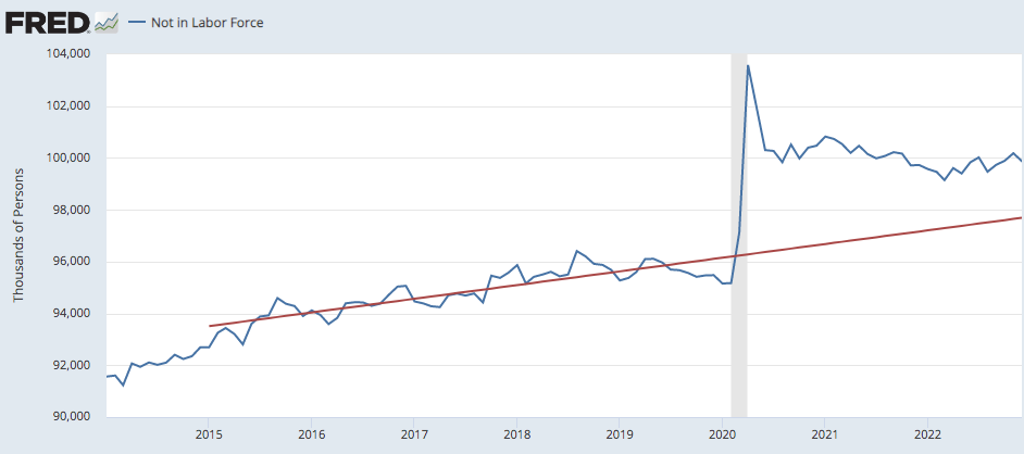
Another commenter linked to this graph:

I hate it when people draw trend lines over cyclical data; they seduce us into seeing patterns that are not there. It’s like drawing a line from the 2009 trough to the 2019 peak for “trend RGDP”. This is done all the time, and probably deserves a new post. But I’m too lazy.
The problem here is that the trend growth in “not in labor force” is gradually accelerating over this entire period, due to the increasing retirement of boomers. During economic booms such as the late 2010s, the rate of growth slows briefly. But the underlying trend is rising, and is steeper than the line shown on this graph. Draw a slowly rising trend line through the very first and the very last point, and you’ll have a more accurate read of the actual trend. The late 2010s are below the actual trend line due to the cyclically strong economy. (Just as RGDP growth was above trend.)