Whenever the BLS posts their monthly CPI there’s always the same response from critics that the index is flawed. That’s fine. I think a healthy dose of skepticism regarding government data is perfectly good. So let’s take a look at some independent gauges to see where prices are.
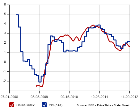
According to MIT’s Billion Prices Project inflation is running about 1.7% almost perfectly in-line with the BLS:
The ECRI’s Future Inflation Gauge is showing prices at a bit higher level. The index was up to 104 from 98.9 last December. That’s a 5.2% increase. Not exactly in-line with the BLS data.
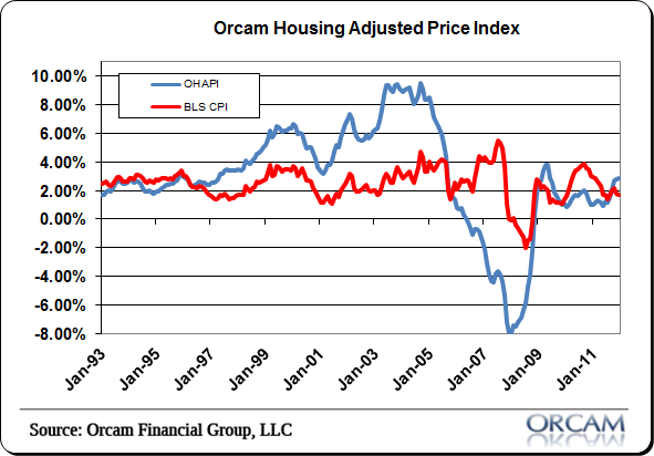
The Orcam Housing Adjusted Price Index was at 2.84% on the month. That’s a bit higher than the BLS data, but not far off.
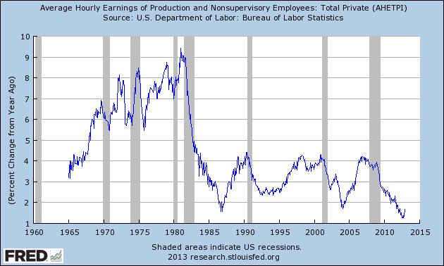
Meanwhile, hourly earnings are near their lows at just 1.7%:
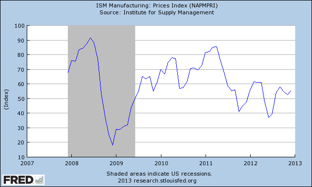
The ISM Manufacturing Survey showed a faster rise in prices to a level of 55.5 from 52.5. But it’s important to note that this is a diffusion index so prices are relatively benign when kept in perspective.
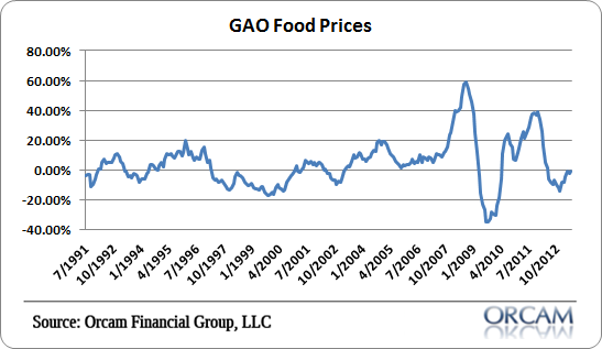
What about food prices? According to the GAO food prices are actually deflating year over year at a rate of -0.7%.
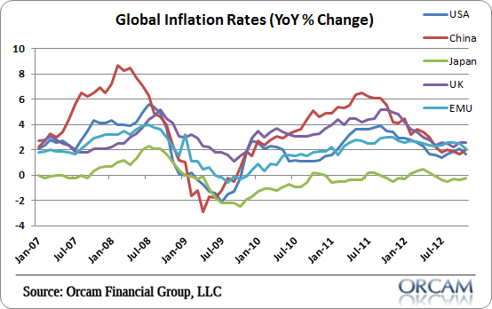
What about global inflation? They’re almost universally in a disinflation:
Even ShadowStats, who has been wrong about hyperinflation for 5 years running, is registering their ShadowStats Alternate index at just above 5%. And that’s certain to be on the high end of the inflation readings which means, even in the worst case scenario, inflation is about 1.5% above its historical average.
I think it’s healthy to remain skeptical of the BLS data. Their readings are definitely on the low end of the spectrum presented here. But I think it’s also clear that they’re probably not far off from the true rates of inflation as most of these readings average out to something resembling the Orcam Housing Adjusted Price Index more than anything else. All in all, the price data is fairly benign. Certainly nothing worth panicking over.
The post What Do The Independent Inflation Gauges Say? appeared first on PRAGMATIC CAPITALISM.
