One of the primary goals of Quantitative Easing is the portfolio rebalancing effect and subsequent wealth effect that supposedly occurs as the Fed reduces outstanding private sector bond holdings and forces investors to chase returns up the risk spectrum into other asset classes to replace lost potential real returns. I won’t discuss the aspects of “money printing” and “debt monetization” here (which I think the mainstream gets mostly wrong), but rather, I’d like to focus on the pure data between periods when reserves are increasing and stock returns.
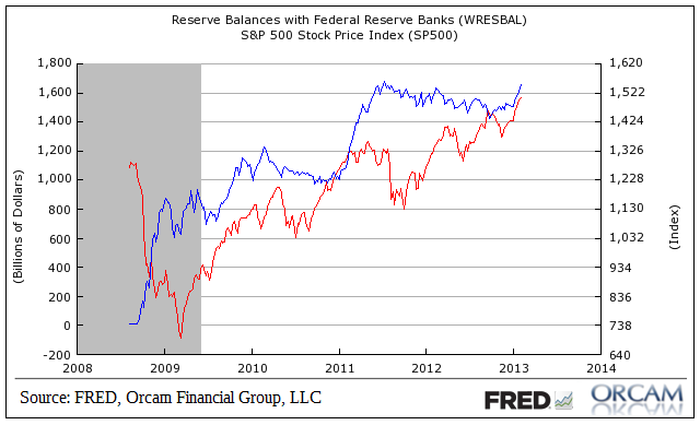
We’ve now had over 4 years of varying forms of QE so the data is quite a bit more constructive than at times in the past when most of us were just speculating about QE’s impacts. At first glance, the chart below might lead one to conclude that there is a very strong correlation between between QE and equity market returns, but the data is not so conclusive upon closer inspection. This has been due to the way the programs were implemented in staggered steps over the years with periods of buying tending to be rather short. Contrary to popular opinion, during the majority of the time in the last 4 years reserve balances have been stagnant or even declining. On a weekly basis, reserve balances have been rising just 47% of the time and have actually been declining 53% of the time.
Since QE began in late 2008 there’s a correlation between reserve balances and stock returns of just 0.65. But that’s not a completely fair look at the data. There have been four distinct periods when reserve balances were surging or declining/stagnant over the last 4+ years. I’ve broken this down more clearly below
Periods when reserve balances were increasing includes (on a weekly basis):
9/10/2008 – 1/7/2009
2/11/2009 – 5/20/2009
6/24/2009 – 2/24/2010
11/17/2010 – 7/13/2011
Periods when reserve balances were declining substantially include:
1/7/2009 – 2/11/2009 (reserve balances fell by 31%)
5/20/2009 – 6/24/2009 (reserve balances fell by 12.5%)
2/24/2010 – 11/17/2010 (reserve balances fell by 20%)
7/13/2011 – 9/26/2012 (reserve balances fell by 15%)
What’s interesting here is that the correlation between stock returns and decreases or increases in reserve balances is not quite as clear cut as most presume. See below for returns during reserve balance increases:
9/10/2008 – 1/7/2009 (S&P 500 DECLINED by 25%)
2/11/2009 – 5/20/2009 (S&P 500 INCREASED by 6%)
6/24/2009 – 2/24/2010 (S&P 500 INCREASED by 22%).
11/17/2010 – 7/13/2011 (S&P 500 INCREASED by 11%).
That looks pretty much as we might expect. But things get more interesting when we look at periods when reserve balances were declining:
1/7/2009 – 2/11/2009 (S&P 500 DECREASED by -10%)
5/20/2009 – 6/24/2009 (S&P 500 INCREASED by 1%)
2/24/2010 – 11/17/2010 (S&P 500 INCREASED by 8%)
7/13/2011 – 9/26/2012 (S&P 500 INCREASED by 9%)
In other words, regardless of whether reserve balances were rising or falling, stock prices were mostly rising. Even in the face of substantial declines in reserve balances over the last 4+ years the S&P 500 has risen. Of course, there are a lot of moving parts in this data, but the correlation between stocks and reserve balances is not terribly clear when we get granular with the data.
( Chart via Orcam Investment Research)
The post QE & Stock Prices – A Review of Recent Data appeared first on PRAGMATIC CAPITALISM.
