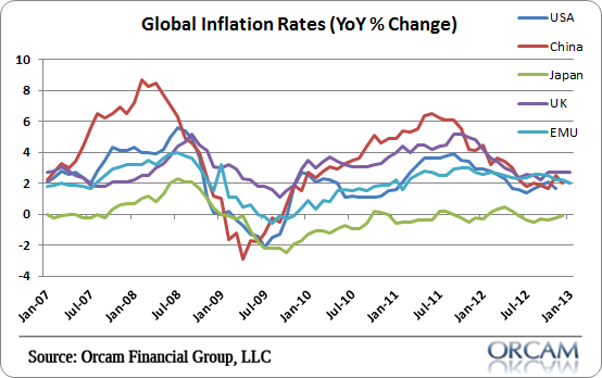
Here’s a follow-up on yesterday’s US CPI release. The following chart shows the year over year changes in global inflation. I’ve included most of the major economies including the USA, China, Japan, UK, and EMU.
Consistent with the rather stagnant global economy, inflation rates appear stagnant as well. It’s clearly not just a US or European phenomenon. And it’s clearly not just a BLS data conspiracy. It’s just a world of low inflation largely due to weak economic environments.
Chart via Orcam Investment Research:
The post Visualizing Global Inflation Rates appeared first on PRAGMATIC CAPITALISM.
