With all the Sell in May talk, I thought it might be helpful to see how bad May has actually been, seasonally speaking.
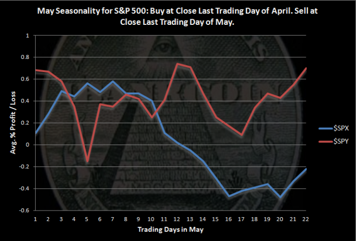
Click on the chart to enlarge. Calculations start at the close of the last trading day of April and end on the close of the last trading day of May.
$SPX data goes back to 1928. $SPY data goes back to 1993. The two sets of data demonstrate how May seasonality has changed recently, if recently is over the last 20 years.
May Statistics for $SPY ($SPX)
- Average Monthly Profit/Loss = 0.70% (-0.22%)
- Winning Months= 60.00% (54.12%)
- Worst May = 2010 loss of -7.9% (1940 loss of -24.1%)
- Best May = 2001 gain of +6.2% (1990 gain +9.2%)
The data show that May has historically been weak, but over the last 20 years, May has been able to grind out gains.
I want to note that the gap up shown in the $SPY results on the first day in May caught my attention. I thought that there was likely an error somewhere in my code. I have not been able to find any error, and going through charts by hand, it does seem that the first day of May has tended to see a rather large gap up, at least over the last 20 years.
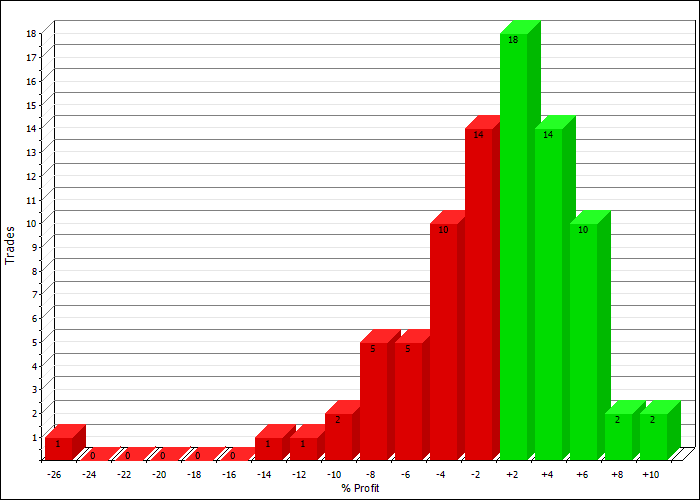
Profit Distributions, Using $SPX Data
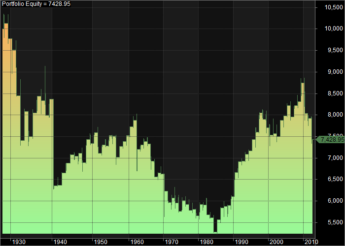
Equity Curve:
The equity curve shows that May tended to be weak from 1928 to around 1985. Since then, the month has tended to close higher. This shows that one has to be careful blindly following market mantras.
If you are interested in this monthly seasonality type study, Market Sci has recently penned a couple of excellent posts on this subject:
Calendar Month Seasonality Debunked?


