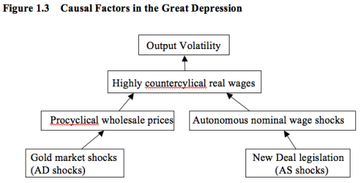
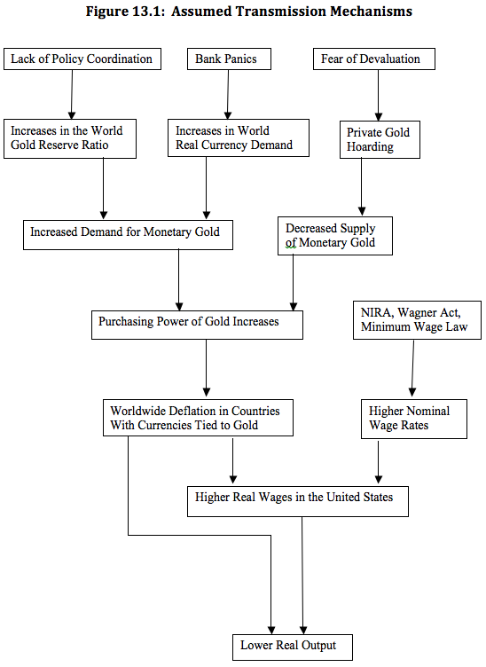
My book on the Great Depression is officially being released on December 1st. At that time I plan to do a few posts discussing the book. But since some have already received copies, I thought it might help to provide a quick overview for what is a fairly complicated hypothesis. The book is certainly not “easy reading”, and I’m hoping the following two charts will make it easier to follow the thread of the argument. (In other words, unlike Garett Jones I didn’t take Bryan Caplan’s advice.)
Here is a flow chart in the first chapter:
 The final chapter (13) includes a more detailed model, intended for serious scholars. In that chapter I also have a more detailed flow chart, which explains how all the pieces fit together:
 If you get confused while reading the book, consult these flow charts. They explain how each piece of the puzzle fits together. When I wrote the book (it was done by about 2005) I had no idea that more than 50 people would ever read it, so I wrote it at a level aimed at specialists. Now it seems that many more people than I expected will read the book. Obviously I’m pleased by the interest, but quite honestly if you only have time to read one economics book this year, make it Garett Jones’s Hive Mind, not my book.