These indicators are mostly for travel and entertainment. It will interesting to watch these sectors recover as the vaccine is distributed.
The TSA is providing daily travel numbers.
 Click on graph for larger image.
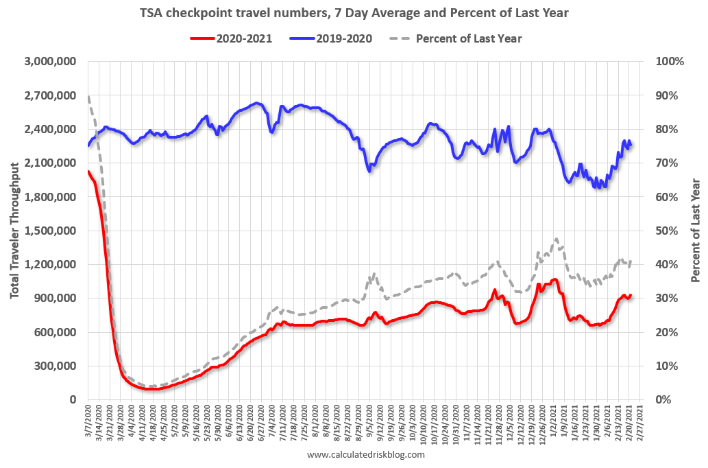
This data shows the seven day average of daily total traveler throughput from the TSA for 2019-2020 (Blue) and 2020-2021 (Red).
The dashed line is the percent of last year for the seven day average.
This data is as of February 21st.
The seven day average is down 58.8% from last year (41.2% of last year). (Dashed line)
There was a slow increase from the bottom, with ups and downs due to the holidays – but TSA data has mostly moved sideways.
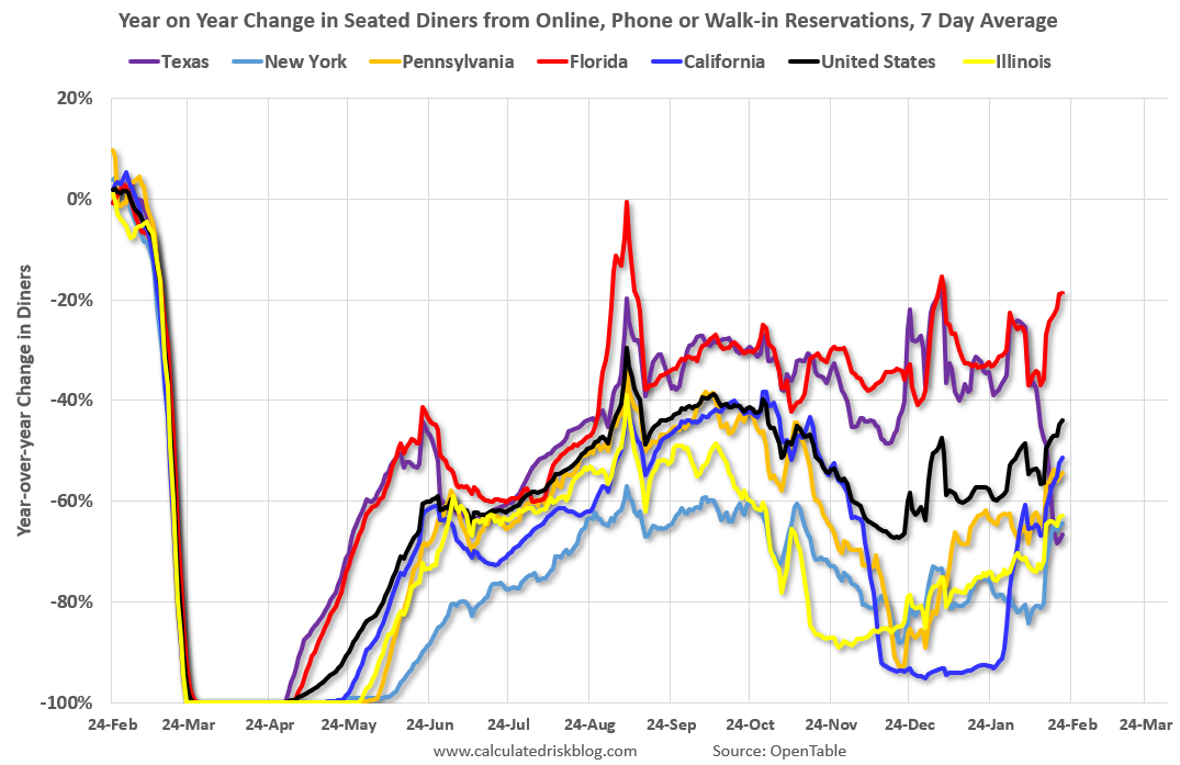
The second graph shows the 7 day average of the year-over-year change in diners as tabulated by OpenTable for the US and several selected cities.
 Thanks to OpenTable for providing this restaurant data:
This data is updated through February 20 2021.
This data is “a sample of restaurants on the OpenTable network across all channels: online reservations, phone reservations, and walk-ins. For year-over-year comparisons by day, we compare to the same day of the week from the same week in the previous year.”
Note that this data is for “only the restaurants that have chosen to reopen in a given market”. Since some restaurants have not reopened, the actual year-over-year decline is worse than shown.
Dining picked up during the holidays. Note that dining is generally lower in the northern states – Illinois, Pennsylvania, and New York. Dining in Texas declined sharply due to the weather.
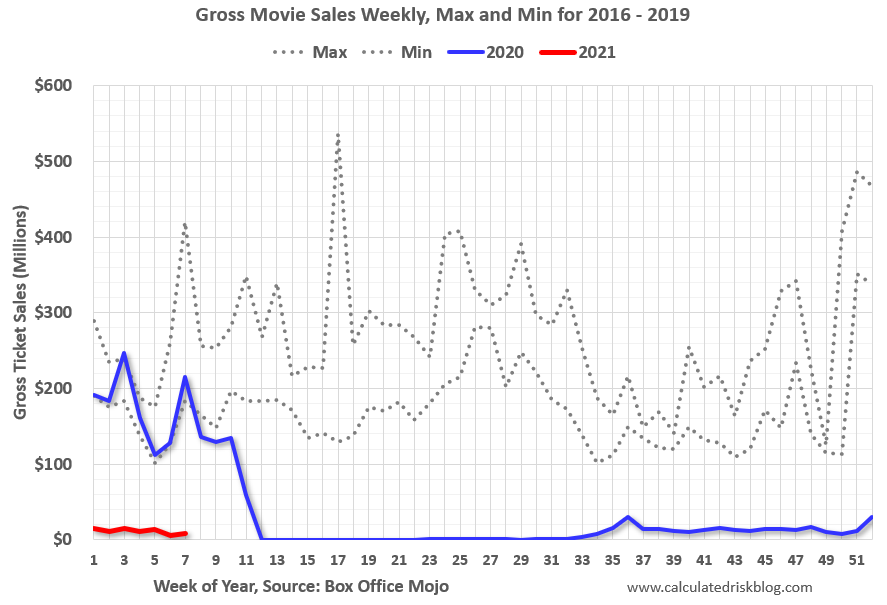 This data shows domestic box office for each week (red) and the maximum and minimum for the years 2016 through 2019. Blue is 2020 and Red is 2021.
 Note that the data is usually noisy week-to-week and depends on when blockbusters are released.
Movie ticket sales were at $8 million last week (compared to usually around $200 million per week at this time of year).
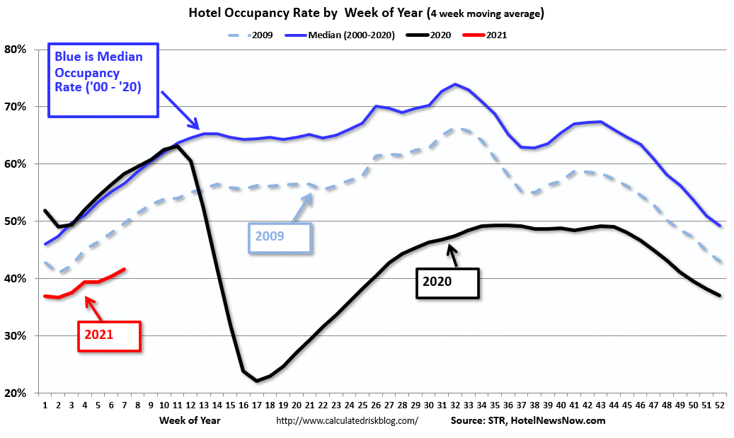 This graph shows the seasonal pattern for the hotel occupancy rate using the four week average.
The red line is for 2021, black is 2020, blue is the median, and dashed light blue is for 2009 (the worst year since the Great Depression for hotels – before 2020).
This data is through February 13th. Hotel occupancy is currently down 29.0% year-over-year. Seasonally we’d expect that business travel would start to pick up in the new year, but there will probably not be much pickup early in 2021.
Notes: Y-axis doesn’t start at zero to better show the seasonal change.
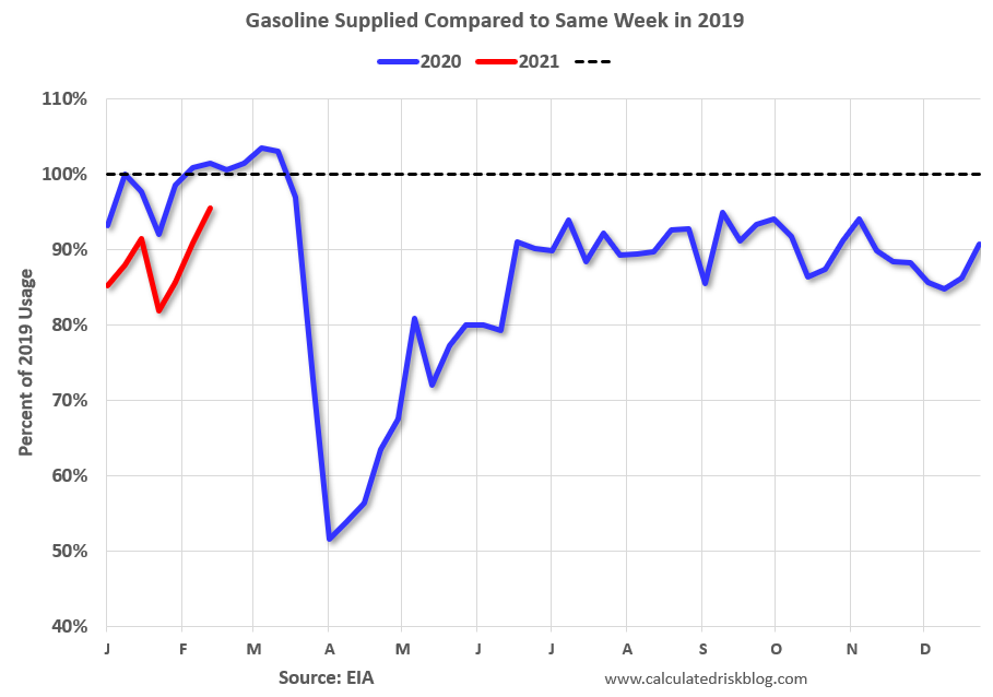 This graph, based on weekly data from the U.S. Energy Information Administration (EIA), shows gasoline supplied compared to the same week of 2019.
Blue is for 2020. At one point, gasoline supplied was off almost 50% YoY. Red is for 2021.
As of February 12th, gasoline supplied was off about 4.5% (about 95.5% of the same week in 2019).
Note: People driving instead of flying might have boosted gasoline consumption.
This graph is from Apple mobility. From Apple: “This data is generated by counting the number of requests made to Apple Maps for directions in select countries/regions, sub-regions, and cities.” This is just a general guide – people that regularly commute probably don’t ask for directions.
There is also some great data on mobility from the Dallas Fed Mobility and Engagement Index. However the index is set “relative to its weekday-specific average over January–February”, and is not seasonally adjusted, so we can’t tell if an increase in mobility is due to recovery or just the normal increase in the Spring and Summer.
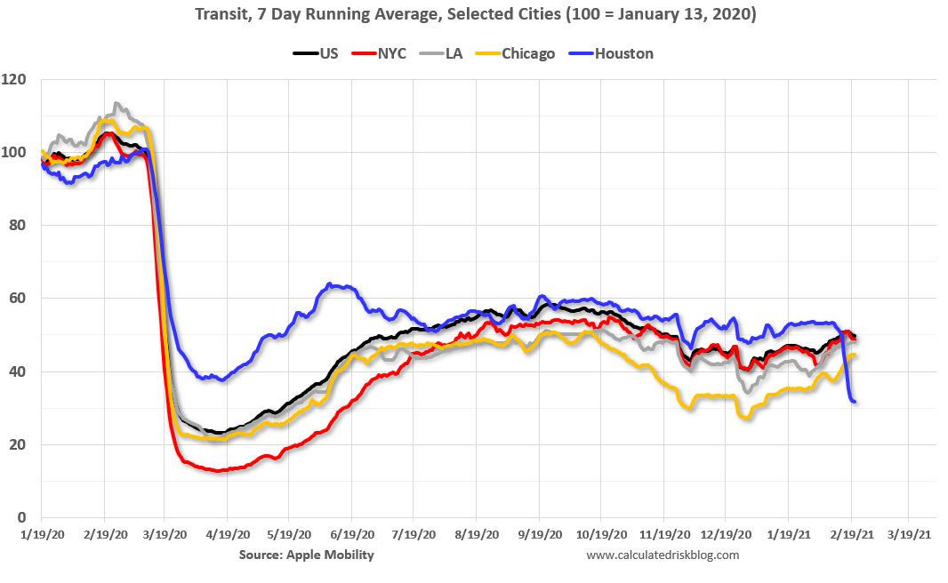 This data is through February 20th for the United States and several selected cities.
The graph is the running 7 day average to remove the impact of weekends.
IMPORTANT: All data is relative to January 13, 2020. This data is NOT Seasonally Adjusted. People walk and drive more when the weather is nice, so I’m just using the transit data.
According to the Apple data directions requests, public transit in the 7 day average for the US is at 50% of the January 2020 level. It is at 44% in Chicago, and 32% in Houston (weather related decline) – and mostly moving sideways, and moving up a little recently.
Here is some interesting data on New York subway usage (HT BR).
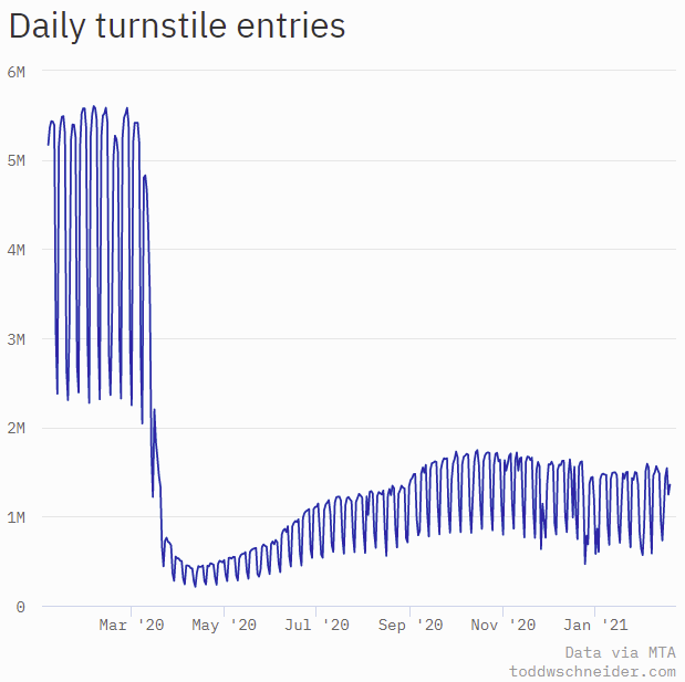 This graph is from Todd W Schneider. This is daily data since early 2020.
This data is through Friday, February 19th.
Schneider has graphs for each borough, and links to all the data sources.
He notes: “Data updates weekly from the MTA’s public turnstile data, usually on Saturday mornings”.