A November Fed study on the Causes of Declines in the Labor Force Participation Rate by Shigeru Fujita at the Federal Reserve Bank of Philadelphia concludes “The decline in the participation rate in the last one-and-a-half years (when the unemployment rate declined faster than expected) is entirely due to retirement.“
Fujita based that statement on BLS surveys that look at the underlying reasons people give for nonparticipation.
The CPS divides nonparticipants into three broad categories: disabled, retired, and others. The last category includes nonparticipation due to “discouragement.”
Based on respondents’ reasons for nonparticipation, weighted by age group, Fujita produced this chart (trendlines in red by me).
Nonparticipation Rates by Reason
I do not doubt for one second the chart represents responses given to the BLS. But is there any evidence the answers given to the BLS are correct?
Let’s explore the question in a series of step-by-step charts.
First a chart by Doug Short at Advisor Perspectives that shows participation rates of various age groups.
Age 50 and Older Participation Rates
Interestingly, the biggest decline in labor force in percentage terms is in the 50-54 group. However, that is not conclusive. Because older workers’ participation rates are lower, the increase in the share of old workers by itself pushes down the aggregate participation rate.
To determine what is really happening, we need to look at age-group weighted effects on the participation rate. I asked reader Tim Wallace to explore that idea in a set of charts.
Note: Both Doug Short and Tim Wallace have better charting skills than I have. I frequently ask them for charts of this nature to explore ideas that I have.
Here’s the specific question I asked: What age groups account for the decline in labor force?
For this question, we need to look at all groups, not just 50 and older. As customary, Wallace uses not-seasonally adjusted data.
For all of the following charts, Wallace compares November of 2013 to November in prior years.
As with the earlier chart, the decline in age group 50-54 relative to 55-64 is suspicious but inconclusive. We need stats on the population itself to draw valid conclusions.
Percentage Makeup of Civilian Non-Institutional Population by Age Group
Note the recent rise in the 65+ population demographic, the rise in 55-64 demographic, the decline in the 25-49 group, and the flattening of the 50-54 age group.
All of these are as expected. Now let’s hone in on what has transpired since 2010.
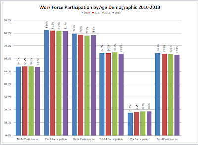
Participation Rates by Age Group 2010-2013
By multiplying the age group population % by the age group participation rate, we can calculate contributions to the overall participation rate. The next chart does that.
Focus on Percentages is Wrong
The impact on the overall participation rate of the 55-64 age group only increased from 9.8% to 10.2%. Similarly, the impact on the overall participation rate of the 65+ age group only increased from 2.9% to 3.3%.
Does that prove or disprove the Fed thesis?
The answer is neither. Looking at participation rates (percentages) in isolation cannot address the question.
Because of demographic shifts, we need to look at the hard numbers, specifically the growth (or decline) in labor force relative to the growth (or decline) in population.
I asked Wallace to do just that. Here are the results.
Overall Labor Force and Civilian Population by Age Group
The above chart does answer the question as to whether or not the Fed thesis is reasonable. However, it’s not easy to see. A chart of relative growth will be easier to understand.
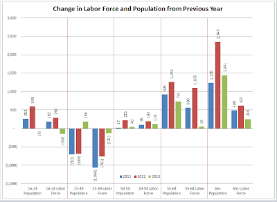
Change in Labor Force and Population From Previous Year
In the above chart, the change in labor force and the change in population in hard numbers (not percentage terms) are side-by-side.
Consider the numbers for 2012 for age group 65+: The population rose by 2,349,000 but the labor force only rose by 621,000.
What happened to the rest? Retirement?
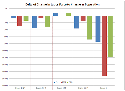
To make it even easier to see, please consider this final chart, with subtractions made.
Delta of Change in Labor Force to Change in Population
The decline in labor force relative to the growth in population is heavily concentrated in the 65 and older demographic.
This is proof that the analysis by the Fed is indeed reasonable.
A rally in the stock market is one possible reason. Also, there may may be a lot of teachers, police officers, and firefighters who just put in their required number of years to be eligeble to collect their pensions.
Implications
Regardless of why, the number of retirees collecting pensions or social security is increasing at a rapid pace while the number of those contributing to social security is declining.
Moreover, those retiring are in general making more money than new workers coming into the system.
The already stressed pension and social security programs will be coming under increased stress. We all knew this would happen sometime, and it started in a big way about 1.5 to 2 years ago.
Mike “Mish” Shedlock
http://globaleconomicanalysis.blogspot.com


