Overall the economic data was weaker than expected last week, even the housing data. New home sales were at a seasonally adjusted annual rate (SAAR) of 368 thousand in October, below expectations of 387,000. However sales are still up close to 20% from 2011.
Hurricane Sandy continues to negatively impact the economic numbers. Personal income and outlays for October were especially weak, and weekly initial unemployment claims remained elevated.
And, once again, the regional manufacturing surveys indicated contraction (except Richmond).
Overall this was a disappointing week, but it is difficult to separate out the underlying trend from the impact of Hurricane Sandy.
Of course most of the headlines last week were about the so-called “fiscal cliff”. Some news agencies are running embarrassing countdown timers, even though there is no drop dead date. I still think a deal in early January is likely, although I’d like to see an agreement reached sooner.
Here is a summary of last week in graphs:
• New Home Sales at 368,000 SAAR in October
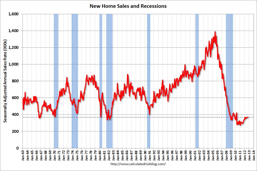 The Census Bureau reports New Home Sales in October were at a seasonally adjusted annual rate (SAAR) of 368 thousand. This was down from a revised 369 thousand SAAR in August (revised down from 389 thousand).
The first graph shows New Home Sales vs. recessions since 1963. The dashed line is the current sales rate.
On inventory, according to the Census Bureau:
“A house is considered for sale when a permit to build has been issued in permit-issuing places or work has begun on the footings or foundation in nonpermit areas and a sales contract has not been signed nor a deposit accepted.”
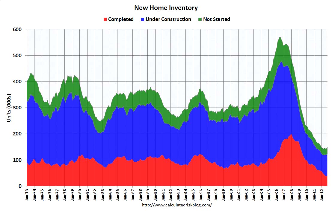
Starting in 1973 the Census Bureau broke this down into three categories: Not Started, Under Construction, and Completed.
This graph shows the three categories of inventory starting in 1973.
The inventory of completed homes for sale was just above the record low in October. The combined total of completed and under construction is also just above the record low since “under construction” is starting to increase.
The last graph shows sales NSA (monthly sales, not seasonally adjusted annual rate).
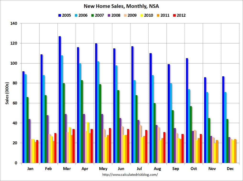 In October 2012 (red column), 29 thousand new homes were sold (NSA). Last year only 25 thousand homes were sold in October. This was the third weakest October since this data has been tracked (above 2011 and 2010). The high for October was 105 thousand in 2005.
New home sales have averaged 361 thousand SAAR over the first 10 months of 2012, up sharply from the 307 thousand sales in 2011. Also sales are finally at the lows for previous recessions too.
This was below expectations of 387,000.
New Home Sales graphs
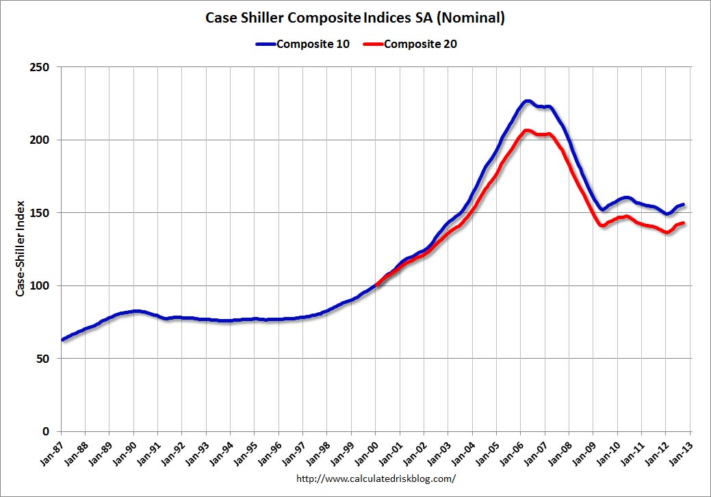
• Case-Shiller: Comp 20 House Prices increased 3.0% year-over-year in September
 From S&P: Home Prices Rise for the Sixth Straight Month According to the S&P/Case-Shiller Home Price Indices
Note: These graphs use the Seasonally Adjusted (SA) data.
The first graph shows the nominal seasonally adjusted Composite 10 and Composite 20 indices (the Composite 20 was started in January 2000).
The Composite 10 index is off 31.4% from the peak, and up 0.3% in September (SA). The Composite 10 is up 4.2% from the post bubble low set in January 2012 (SA).
 The Composite 20 index is off 30.7% from the peak, and up 0.4% (SA) in September. The Composite 20 is up 4.7% from the post-bubble low set in January 2012 (SA).
The second graph shows the Year over year change in both indices.
The Composite 10 SA is up 2.1% compared to September 2011.
The Composite 20 SA is up 3.0% compared to September 2011. This was the fourth consecutive month with a year-over-year gain since 2010 (when the tax credit boosted prices temporarily).
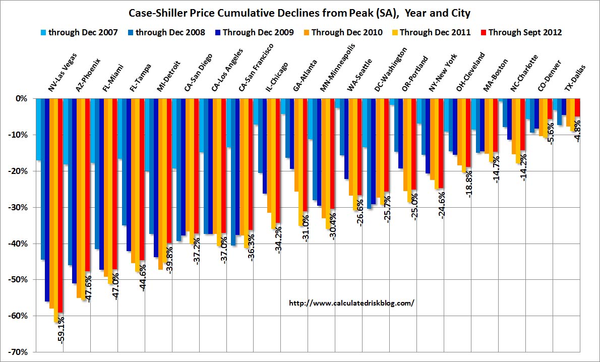 The third graph shows the price declines from the peak for each city included in S&P/Case-Shiller indices.
Prices increased (SA) in 19 of the 20 Case-Shiller cities in September seasonally adjusted (15 of 20 cities increased NSA). Prices in Las Vegas are off 59.1% from the peak, and prices in Dallas only off 4.8% from the peak. Note that the red column (cumulative decline through September 2012) is above previous declines for all cities.
All Current House Price Graphs
• Real House Prices, Price-to-Rent Ratio
Case-Shiller, CoreLogic and others report nominal house prices, and it is also useful to look at house prices in real terms (adjusted for inflation) and as a price-to-rent ratio.
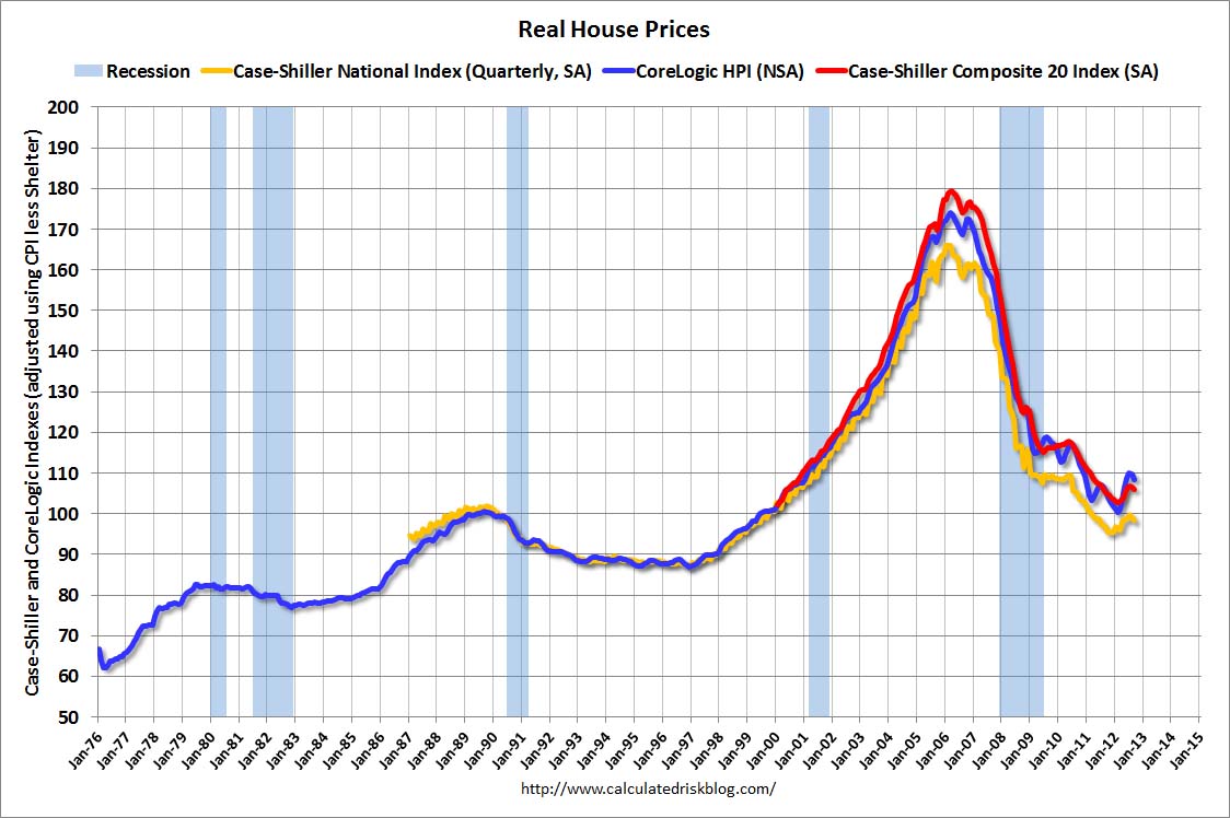 This graph shows the quarterly Case-Shiller National Index SA (through Q3 2012), and the monthly Case-Shiller Composite 20 SA and CoreLogic House Price Indexes (through September) in real terms (adjusted for inflation using CPI less Shelter). Note: some people use other inflation measures to adjust for real prices.
In real terms, the National index is back to mid-1999 levels, the Composite 20 index is back to June 2000, and the CoreLogic index back to February 2001.
In real terms, most of the appreciation in the last decade is gone.
In October 2004, Fed economist John Krainer and researcher Chishen Wei wrote a Fed letter on price to rent ratios: House Prices and Fundamental Value. Kainer and Wei presented a price-to-rent ratio using the OFHEO house price index and the Owners’ Equivalent Rent (OER) from the BLS.
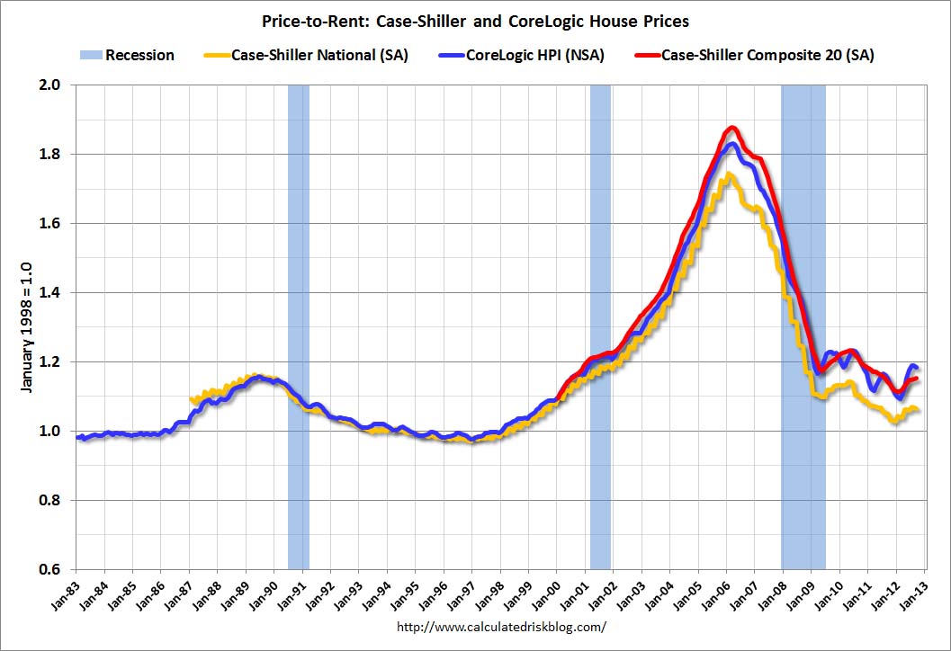 Here is a similar graph using the Case-Shiller National, Composite 20 and CoreLogic House Price Indexes.
This graph shows the price to rent ratio (January 1998 = 1.0).
On a price-to-rent basis, the Case-Shiller National index is back to Q3 1999 levels, the Composite 20 index is back to July 2000 levels, and the CoreLogic index is back to February 2001.
In real terms – and as a price-to-rent ratio – prices are mostly back to 1999 or early 2000 levels.
All Current House Price Graphs
• Personal Income unchanged in October, Spending decreased 0.2%
 The BEA released the Personal Income and Outlays report for October:
Personal income increased $0.4 billion, or less than 0.1 percent … in October, according to the Bureau of Economic Analysis. Personal consumption expenditures (PCE) decreased $20.2 billion, or 0.2 percent.
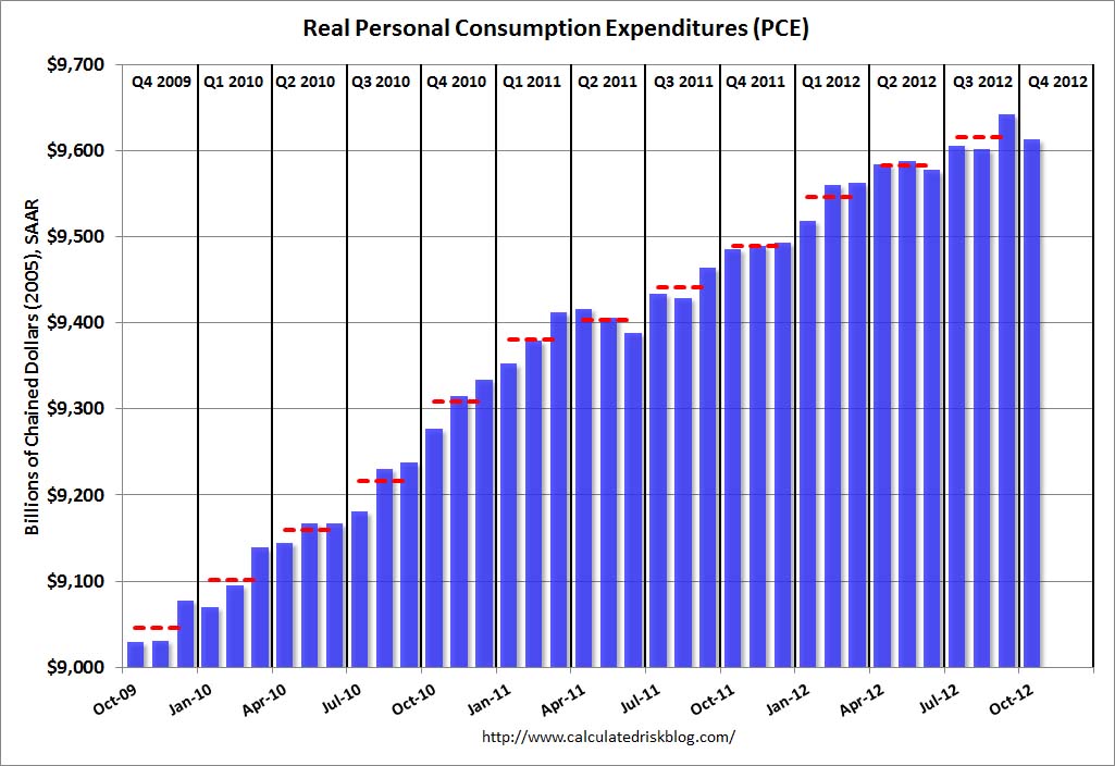
This graph shows real PCE by month for the last few years. The dashed red lines are the quarterly levels for real PCE. According to the BEA, Hurricane Sandy impacted PCE in October, but the BEA could not quantify the total impact – however PCE in October was weak.
A key point is the PCE price index has only increased 1.7% over the last year, and core PCE is up only 1.6%.
• Weekly Initial Unemployment Claims decline to 393,000
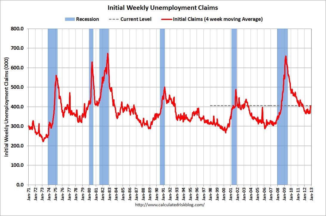
The dashed line on the graph is the current 4-week average. The four-week average of weekly unemployment claims increased to 405,250.
This sharp increase in the 4 week average is due to Hurricane Sandy as claims increased significantly in the impacted areas (update: claims increased in NY, NJ and other impacted areas over the 4-week period – some of those areas saw a decline this week). Note the spike in 2005 related to hurricane Katrina – we are seeing a similar impact, although on a smaller scale.
All current Employment Graphs
• Regional Manufacturing Surveys mostly weak in November
Most of the regional manufacturing surveys were weak in November (Richmond was the exception). From the Kansas City Fed: Tenth District Manufacturing Activity Eased Further
The month-over-month composite index was -6 in November, down from -4 in October and 2 in September.
From the Dallas Fed: Texas Manufacturing Activity: Growth Stalls and Company Outlook Worsens
The general business activity index fell to -2.8, returning to negative territory. The company outlook index moved down to -4.8, registering its first negative reading since April.
From the Richmond Fed: Manufacturing Activity Advanced in November; Optimism Increased
In November, the seasonally adjusted composite index of manufacturing activity — our broadest measure of manufacturing — gained sixteen points to 9 from October’s reading of −7.
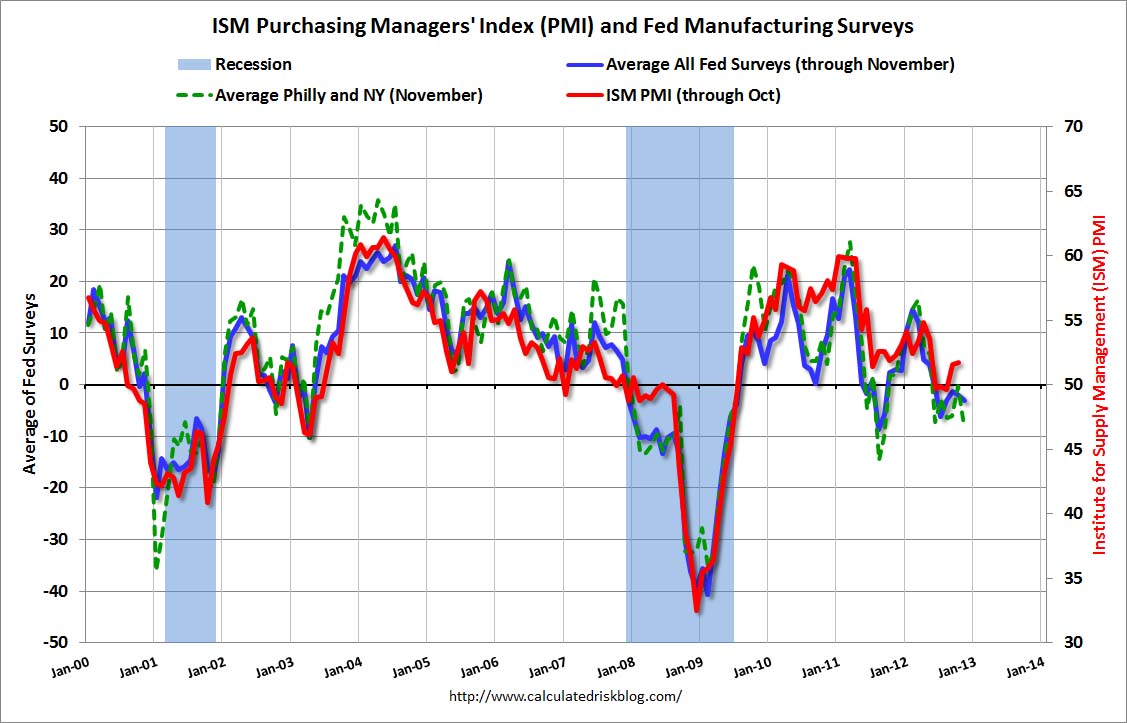 Here is a graph comparing the regional Fed surveys and the ISM manufacturing index:
The New York and Philly Fed surveys are averaged together (dashed green, through November), and five Fed surveys are averaged (blue, through November) including New York, Philly, Richmond, Dallas and Kansas City. The Institute for Supply Management (ISM) PMI (red) is through October (right axis).
The ISM index for November will be released Monday, Dec 3rd, and these surveys suggest another weak reading.