I’ve written extensively about the participation rate, see: Understanding the Decline in the Participation Rate and Further Discussion on Labor Force Participation Rate.
A key point: The recent decline in the participation rate was expected, and most of the decline in the participation rate was due to changing demographics, as opposed to economic weakness.
Here is an update to a few graphs I’ve posted before. Tracking the participation rate for various age groups monthly is a little like watching grass grow, but the trends are important.
 Click on graph for larger image in graph gallery.
Here is a repeat of the graph I posted Friday showing the participation rate and employment-to-population ratio.
The Labor Force Participation Rate decreased to 63.6% in November (blue line. This is the percentage of the working age population in the labor force.
Here is a look at some of the long term trends (updating graphs through November 2012):
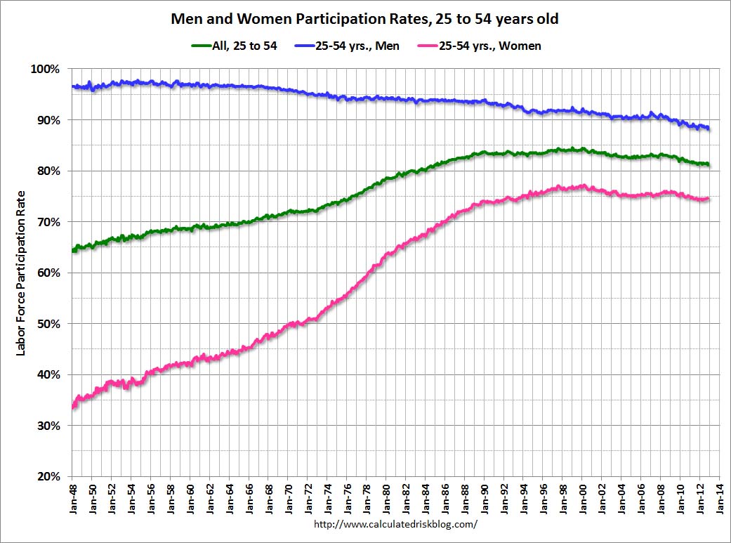 This graph shows the changes in the participation rates for men and women since 1960 (in the 25 to 54 age group – the prime working years).
The participation rate for women increased significantly from the mid 30s to the mid 70s and has mostly flattened out. The participation rate for women was unchanged in November at 74.7%.
The participation rate for men decreased from the high 90s decades ago, to 88.2% in November 2012.
This is the lowest level recorded for prime working age men.
 This graph shows that participation rates for several key age groups.
There are a few key long term trends:
• The participation rate for the ’16 to 19′ age group has been falling for some time (red). This was unchanged in November at 34.7%, up from the record low of 33.5% in February 2011.
• The participation rate for the ‘over 55’ age group has been rising since the mid ’90s (purple), although this has stalled out a little recently.
• The participation rate for the ’20 to 24′ age group fell recently too (more education before joining the labor force). This appears to have stabilized.
 The third graph shows the participation rate for several over 55 age groups. The red line is the ’55 and over’ total seasonally adjusted. All of the other age groups are Not Seasonally Adjusted (NSA).
The participation rate is generally trending up for all older age groups, and the 55 and over participation rate is at a record high.
The increase in participation of older cohorts might push up the ’55 and over’ participation rate over the next few years, however eventually the ‘over 55’ participation rate will start to decline as the oldest baby boomers move into even older age groups.
I’ve been expecting some small bounce back in the participation rate, but I don’t think the bounce back will be huge – and that means it is taking fewer jobs than some expected to lower the unemployment rate. This will be a key number to watch over the next few years.
Earlier on employment:
• November Employment Report: 146,000 Jobs, 7.7% Unemployment Rate
• Employment Report: More Positives than Negatives
• All Employment Graphs