Earlier on the employment report:
• February Employment Report: 236,000 Jobs, 7.7% Unemployment Rate
• Employment Report Comments and more Graphs
• All Employment Graphs
A few more employment graphs …
Duration of Unemployment
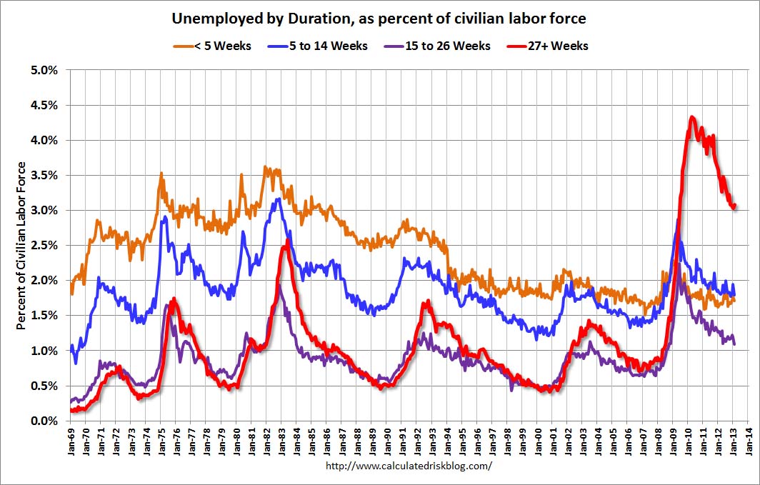 This graph shows the duration of unemployment as a percent of the civilian labor force. The graph shows the number of unemployed in four categories: less than 5 week, 6 to 14 weeks, 15 to 26 weeks, and 27 weeks or more.
The general trend is down for all categories, but only the less than 5 weeks is back to normal levels.
The the long term unemployed is around 3.1% of the labor force – and the number (and percent) of long term unemployed remains a serious problem.
Unemployment by Education
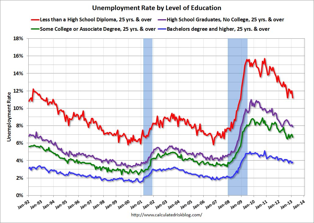 This graph shows the unemployment rate by four levels of education (all groups are 25 years and older).
Unfortunately this data only goes back to 1992 and only includes one previous recession (the stock / tech bust in 2001). Clearly education matters with regards to the unemployment rate – and it appears all four groups are generally trending down.
Although education matters for the unemployment rate, it doesn’t appear to matter as far as finding new employment (all four categories are only gradually declining).
Note: This says nothing about the quality of jobs – as an example, a college graduate working at minimum wage would be considered “employed”.
Diffusion Indexes
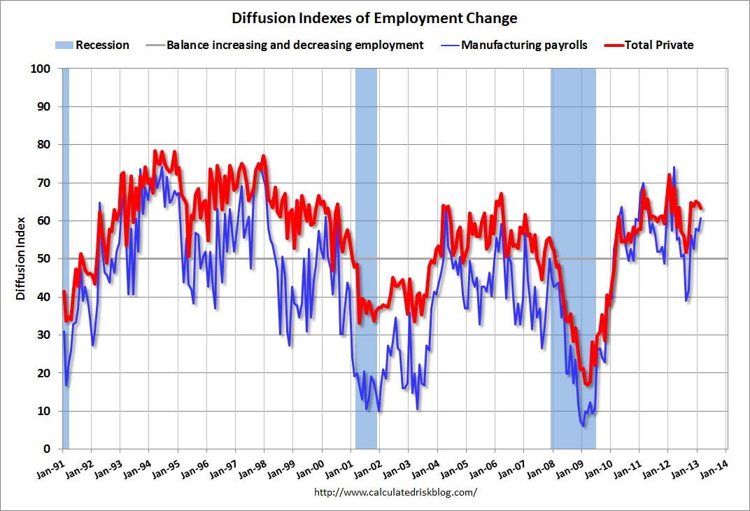 This is a little more technical. The BLS diffusion index for total private employment was at 63.6 in February, down slightly from 64.7 in January. This was the fifth consecutive month over 60. This index has averaged 60.5 over the last 36 months; the best three year period since the ’90s.
For manufacturing, the diffusion index increased to 60.6, up from 57.4 in January.
Think of this as a measure of how widespread job gains are across industries. The further from 50 (above or below), the more widespread the job losses or gains reported by the BLS. From the BLS:
Figures are the percent of industries with employment increasing plus one-half of the industries with unchanged employment, where 50 percent indicates an equal balance between industries with increasing and decreasing employment.
Job growth for both total private employment and manufacturing were fairly widespread in February (both above 60). This is a good sign and suggests many industries are hiring (not just a few).
Earlier:
• Summary for Week Ending March 8th
• Schedule for Week of March 10th