A key point: The recent decline in the participation rate was mostly expected, and most of the decline in the participation rate was due to changing demographics (and long term trends), as opposed to economic weakness.
A few key long terms trends include:
• A decline in participation for those in the 16 to 24 age groups. This is mostly due to higher enrollment rate in school (see the graph at Get the Lead Out Update). This is great news for the future and is directly related to removing lead from the environment (see from Brad Plumer at the WaPo: Study: Getting rid of lead does wonders for school performance)
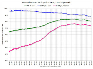
• There is a general long term trend of declining participation for those in the key working years (25 to 54). See the second graph below.
• There has been an increase in participation among older age groups. This is probably a combination of financial need (not good news) and many workers staying healthy or engaged in less strenuous jobs.
Of course, even though the participation rate is increasing for older age groups, there are more people moving into those groups so the overall participation rate falls.
As an example, the participation rate for those in the “55 to 59” group has increased from 71.8% ten years ago, to 73.4% now. And the participation rate for those in the “60 to 64” age group has increased from 50.1% to 55% now. But even though the participation rate for each age group is increasing, when people move from the “55 to 59” age group to the “60 to 64” group, their participation rate falls (from 73.4% to 55%). And right now a large cohort is moving into these older age groups, and this is pushing down the overall participation rate.
Here is an update to a few graphs I’ve posted before. Tracking the participation rate for various age groups monthly is a little like watching grass grow, but the trends are important.
 Click on graph for larger image.
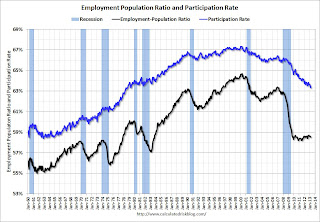
Here is a repeat of the graph I posted Friday showing the participation rate and employment-to-population ratio.
The Labor Force Participation Rate decreased to 63.3% in March (blue line). This is the percentage of the working age population in the labor force.
Here is a look at some of the long term trends (updating graphs through March 2013):
 This graph shows the changes in the participation rates for men and women since 1960 (in the 25 to 54 age group – the prime working years).
The participation rate for women increased significantly from the mid 30s to the mid 70s and has mostly flattened out. The participation rate for women in March was 73.9% (the lowest level since the early ’90s).
The participation rate for men decreased from the high 90s decades ago, to 88.5% in March.
This is just above the lowest level recorded for prime working age men. This declining participation is a long term trend.
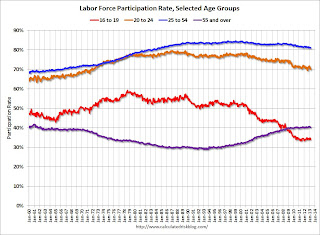
 This graph shows that participation rates for several key age groups.
There are a few key long term trends:
• The participation rate for the ’16 to 19′ age group has been falling for some time (red).
• The participation rate for the ‘over 55’ age group has been rising since the mid ’90s (purple), although this has stalled out a little recently.
• The participation rate for the ’20 to 24′ age group fell recently too (more education before joining the labor force). This appears to have stabilized.
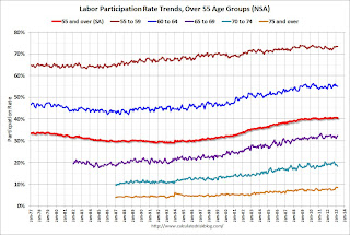
 This graph shows the participation rate for several over 55 age groups. The red line is the ’55 and over’ total seasonally adjusted. All of the other age groups are Not Seasonally Adjusted (NSA).
The participation rate is generally trending up for all older age groups.
The increase in participation of older cohorts might push up the ’55 and over’ participation rate over the next few years, however eventually the ‘over 55’ participation rate will start to decline as the oldest baby boomers move into even older age groups.
The key point is most of the decline in the participation rate was expected. For much more, see: Understanding the Decline in the Participation Rate and Update: Further Discussion on Labor Force Participation Rate.