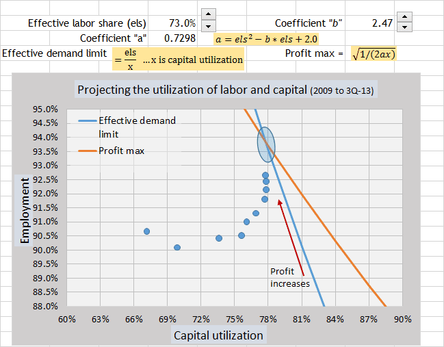
So the cobra equation has made me re-evaluate the dynamics of the effective demand limit. The main reason is that the graph of the Cobra equation shows that capital utilization decreases as employment increases at the effective demand limit. I was assuming that as employment increased, the utilization of capital would also increase. That was an error.
As businesses in the aggregate reach for profits, the path at the effective demand limit shows that capital will be less utilized as labor is more utilized.
I had been thinking that unemployment would bottom out at 6.7% to 7.0%. That was assuming that capital utilization would increase. But now I see that unemployment can go lower, because capital utilization will not increase.
Here is the path of the utilization of labor and capital (blue circles) since 2009 up to today’s data from unemployment. (3rd quarter unemployment is 7.3%, which is 92.7% in the graph.)
Equations for the two lines are given above the graph.
The blue oval shows the projected range of the equilibrium point where profit maximization crosses the effective demand limit. The economy gravitates toward that blue oval area. The utilization of labor and capital (blue circles) is moving along the effective demand limit following increasing profits toward the blue oval.
The Cobra equation is the equation that I have been searching for since last year. Now that I can see it, the dynamics of profit at the effective demand limit are coming clear. I still see the environment for a recession starting in one year, but the dynamics of that environment are clearer.
For reference… here is the Cobra equation to measure the profitability of utilizing labor and capital dependent upon labor share.
Measure of profitability in the aggregate = (x + y) – ax2y2
y = employment rate
a = coefficient for labor share to establish profit maximization.
