On July 24, the Conference Board asked the question: Is Wage Growth Accelerating?
The Board’s answer was “All signs point to Yes!”
One big question regarding the US economy is whether wage growth is accelerating. You might think that this is a pretty straightforward question to answer, but it’s not. There are many measures of wage growth, and they don’t all point in the same direction.
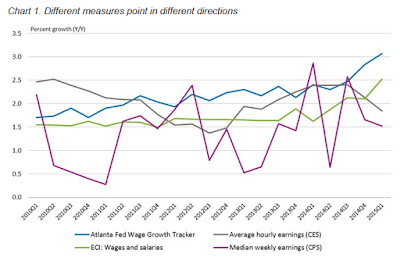
For example, we can compare the year-over-year wage growth in recent years (Chart 1)according to four different measures, three from the US Bureau of Labor Statistics: the Employment Cost Index (wages and salaries), average hourly earnings (Establishment Survey), median weekly earnings (Current Population Survey), and the new Atlanta Fed Wage Growth Tracker. Some of these measures show a significant pickup, but some show no acceleration at all. What should we make of this?
Four Measures of Wage Growth
The Employment Cost Index (ECI) line in green shows a nice looking 2.6% year-over-year growth. The Atlanta Fed model shows an even bigger gain.
Two other measures show stagnation at best. So, which two lines should one believe?
Fresh data may provide a clue.
Shocking Decline in Employment Cost Index
Economists were stunned on Friday July 31 when the Employment Cost Index came in at 0.2% vs. the Bloomberg Consensus ECI estimate of 0.6%. Worse yet, the year-over-year ECI gain plunged from 2.6% to 2.0%.
In a shocking result, the employment cost index rose only 0.2 percent in the second quarter which is far below expectations and the lowest result in the 33-year history of the report. Year-on-year, the ECI fell 6 tenths to plus 2.0 percent which is among the lowest readings on record. The record low for this reading is plus 1.4 percent back in the early recovery days of 2009 when, apparently unlike today, there was enormous slack in the labor market.
The report’s two components both fell back sharply with wages & salaries moving down to plus 0.2 percent from 0.7 percent in the first quarter and benefits at plus 0.1 percent vs the first quarter’s plus 0.6 percent. Year-on-year, wages & salaries are up 2.1 percent with benefits below 2.0 percent at 1.8 percent.
This report, which is very closely watched by policy makers, may very well unsettle the outlook for the Fed’s rate liftoff, pushing expectations to the December FOMC from the September FOMC. For the inflation outlook, wage pressures are supposed to be an offset to still weak commodity prices. The Fed’s 2 percent goal for core inflation is looking elusive.
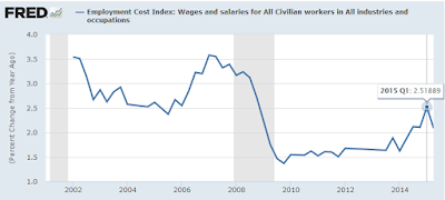
Employment Cost Index Civilian Workers “Wages and Salaries”
Last quarter the year-over-year gain in wages and salaries was 2.52%. That fell to 2.09% in the second quarter. But what about benefits?
Employment Cost Index Civilian Workers “Total Compensation”
Obamacare Effect
Total compensation fell from 2.57% to 1.98%, larger than the decline in wages and salaries. I believe we all know the answer to this one: Obamacare.
Employers are passing on the increased costs of Obamacare to employees.
Longer Timeline Provides Better Picture
None of the above charts accurately display what is really happening with wages and salaries. The time frame is too short.
But we cannot display data we don’t. So let’s take a look at a different data series that is more robust.
Average Hourly Earnings Production and Nonsupervisory Employees
The above chart puts a different perspective on the recent jump in average hourly hourly earnings.
But what about the jump in minimum wages. Should that have a huge impact?
The next two charts will help explain.
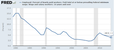
Minimum Wage Employees
Only 3.9% of hourly workers make at or below the federal minimum wage.
Paid Federal Minimum Wage Aged 25 Years and Over
Under 600,000 employees aged 25 or under get paid federal minimum wage.
For all the brouhaha over minimum wages, the above charts help put things into proper perspective.
- Hikes in minimum wages are likely to most affect employment of teens and those in school.
- It will put some small businesses out of business.
- Job growth will slow.
- Teenage employment will likely suffer the most.
Digging still deeper, here are a few more charts to consider.
Real “Usual” Weekly Earnings, Employed Fulltime
For those lucky enough to be working fulltime, median real wages are precisely where they were in first quarter of 2002: $341 a week.
Assuming those people work 52 weeks a year (not likely), that a salary of $17,732.
Caveats
- Benefits not factored in
- Property taxes not factored in
- Chart assumes the CPI has affected you no more than the BLS claims
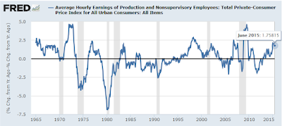
Growth in Average Hourly Earnings Minus Growth in CPI
Let’s now take a look at average hourly nominal earnings.
Here is a chart I put together in Fred. I took the year-over-year change in average hourly earnings and subtracted the year-over-year change in CPI.
During the recession in the 1970s, average real hourly earnings got clobbered. The opposite happened in 2001 and 2007.
Real average hourly earnings are allegedly up 1.76% from a year ago. But, the above chart is also not reflective of the true state of affairs for the same caveats noted above.
Obamacare expenses have risen, and so have rental costs. I believe both are understated in the CPI. And renters in some places have been clobbered.
Let’s hone in on why real hourly earnings are supposedly up 1.76% from a year ago. Here is the same chart overlaid with the year-over-year percent change in CPI.
Growth in Average Hourly Earnings Minus Growth in CPI vs. CPI Growth
Group-Think Economic Illiterates
Average real hourly earnings are up year-over-year for the precise reason the year-over-year CPI change is up a mere 0.18%.
Those renting, those negatively impacted by Obamacare, and those struggling in part-time jobs, are likely to disagree with the notion their wages are going up more than expenses.
Couple that with high and rising student debt. Then factor in those on fixed income, struggling with retirement.
In spite of the above, economists still wonder why people aren’t spending their wage hikes, and “what they save on gasoline”.
What a collective bunch of economic illiterates.
The problem is not lack of rising wages, nor lack of inflation, but rather the Fed’s bubble-blowing boom bust cycles for the benefit of banks and the already wealthy.
Inflation Fighting Nonsense
The red line in the preceding chart shows the absurdity of the Fed’s claim they are “inflation fighters”.
Moreover, and opposite of what the Fed states, and most economists believe, people benefit from falling prices!
Ironically, right on the verge of “price stability” (which I define as stable prices but the Fed defines as rising prices) the Fed desperately seeks more damaging inflation that will further destroy the middle class.
The Fed’s record speaks for itself: bubbles of increasing amplitude over time for the sole benefit of banks, the already wealthy, and government bureaucrats.
Here’s the final irony: The Fed rails against “income inequality” when they are its number 1 sponsor.
Mike “Mish” Shedlock
http://globaleconomicanalysis.blogspot.com


