Inquiring minds are digging still further into social security trends and costs.
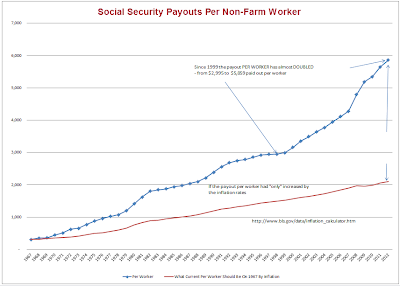
Here is a chart from Tim Wallace in response to my post Social Security Trends: Beneficiaries, Total Costs, Number of Workers, Ratio of Workers to Beneficiaries.
Social Security Burden on Non-Farm Workers
The line in red shows the expected trend if payouts had increased at the rate of inflation. Instead, escalating costs and the shrinking number of workers per beneficiary, has placed tremendous stress on workers ability to support beneficiaries.
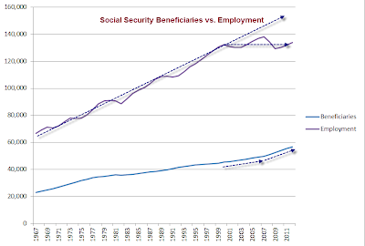
Here are a few of charts from the top link to highlight the reason for this trend.
Average Monthly Social Security Benefit
Social Security Beneficiaries vs. Total Non-Farm Employment
Ratio of Workers to Social Security Beneficiaries
Social Security Benefits Analysis
- The ratio of workers to beneficiaries peaked in 1999 at 2.927 to 1.
- The ratio of workers to beneficiaries was 2.361 to 1 at the end of 2012.
- The ratio of workers to beneficiaries is falling fast and will
continue to fall fast for a decade as the baby boomer population ages. - The average payout and the number of payouts are both rising fast
- Total Social Security payouts (a multiplication of two rising numbers) are on an unsustainable exponential growth path.
Social Security Deficit?
In my first post I cited a CNS News article that made this claim Social Security Ran $47.8B Deficit in FY 2012.
Reader David White objected noting an increase in assets. Here is the chart from the Social Security Administration.
White protests “The “$47.8 billion deficit” mentioned in the post does not include interest income. This omission blatantly misrepresents the Social Security Trust Fund data.”
Blatant Misrepresentation
If anything, the above chart highlights the sheer absurdity of the alleged “Trust Fund”.
The blatant misrepresentation is the notion there is a trust “fund”.
In reality there is no fund, and if there is any trust in the system, there shouldn’t be.
Accrued Interest on Accrued Promises
The assets are nothing but IOUs, and interest income is actually interest on money long since spent.
The entire “Trust Fund” is nothing but a promise to pay. There are no real assets (other than the ability to raise taxes to meet current expenses). Everything else is just a promise, and even more absurdly, accrued interest on accrued promises.
The chart provided by Wallace should give everyone second thoughts about the ability to raise taxes to meet expenses.
Imagination
The key point is Social Security is now cash flow negative (just as the chart provided by White shows), not that imaginary assets have increased in value, based on imaginary interest, and imaginary ability of taxpayers to forever keep meeting escalating payouts.
I offer this musical tribute to those who actually believe there is a trust fund.
Link if video does not play: The Temptations – Just My Imagination
Mike “Mish” Shedlock
http://globaleconomicanalysis.blogspot.com
“Wine Country” Economic Conference Hosted By Mish
Click on Image to Learn More


